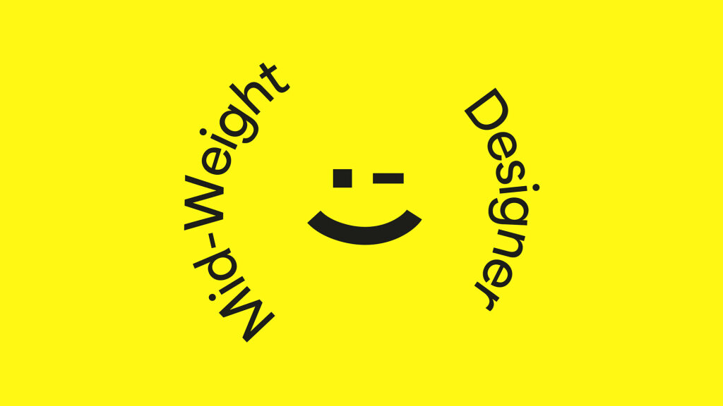
We’re hiring a Mid-weight Designer
News
Uncategorized
6 mins


Thoughts, news and opinions from the studio


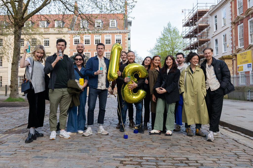
We’re a team of thinkers, makers, movers and shakers, and we’re looking for an enthusiastic Mid-weight Designer to join our team. This is a hands-on creative role. You’ll be working on brand projects of all shapes and sizes, for…
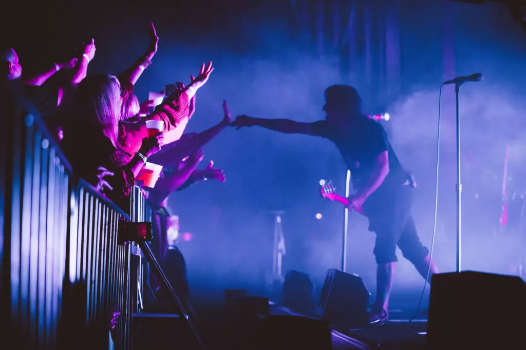
Fiasco rebrand captures the unique spirit of US music festival Britt
from Design Week
Why are so many design agencies rebranding right now?
from Design Week

Fiasco marks 15 years in design with a feelings-first rebrand
from Creative Boom
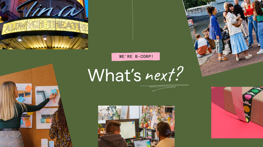
Fiasco’s new identity for Nederlander Theatres
from Design Week

New Visual Identity for Gather Round by Fiasco Design
from Brand New


New Logo and Identity for Eat Curious by Fiasco Design
from Brand New
Fiasco gives new meaning to volunteering, with its branding for OnHand app
from Creative Boom

Fiasco Design's new identity for education provider Bayswater
from Creative Boom