In the modern digital age, creating accessible website design isn’t a nice to have, it’s a necessity. Of the various aspects of digital accessibility, neurodiversity stands out as a critical consideration.
What exactly is neurodiversity? Put simply, the term refers to the natural variations in how our brains process and absorb information. Neurodiversity refers to the unique ways our brains work and highlights that there isn’t a single ‘normal’ way to think and learn. Recent studies predict that 15-20% of the UK population are neurodivergent, meaning up to 1 in 5 visitors to a website have conditions such as autism, ADHD, dyslexia, or other neurological differences.
These differences can significantly impact how individuals navigate websites, use technology and interact with design elements. So, designing accessible websites that cater to diverse processing styles is more than just good design; it’s essential in enhancing user experience, broadening audience reach and ensuring that everyone can engage with (and enjoy) digital content.
Here we unpack how to create an accessible website for everyone.
Design and layout
Clear and consistent layout
Start with the basics; make it super easy for users to navigate your website. A clear menu, intuitive navigation and a logical flow means everyone can move around your website with ease.
Colour contrast
Ensure your colour contrast is sufficient for users with visual impairments or a particular sensitivity to certain colour combinations. Use colour contrast ratio guidelines to ensure text and background colours are easily distinguishable to enhance readability.
For example, when it came to creating an accessible microsite for London’s The Old Vic Theatre, we used colour to differentiate theatre types. Each of these four different colour schemes had to be carefully crafted to ensure we met the AA standard of shading and colour contrast.
Readability
Fonts and paragraphs
Choose readable fonts with clear letters to make text easy to read and inclusive. Sans-serif fonts with options for users to change font sizes help create a personalised and accessible webpage. Break content into small sections and use headings to organise information, this helps people with dyslexia or attention issues and improves the experience for everyone.
Typography was a big factor in our brand identity for NOYO (National Open Youth Orchestra). We opted to use ‘The Accessible Type’ by FS Me. An easy-to-read font, specifically designed to be super legible for everyone.
Text to speech compatibility
Ensure your website works seamlessly with text-to-speech (TTS) software. This isn’t just about ticking an accessibility box; it’s about opening up a world of information for neurodivergent users who rely on this tech.
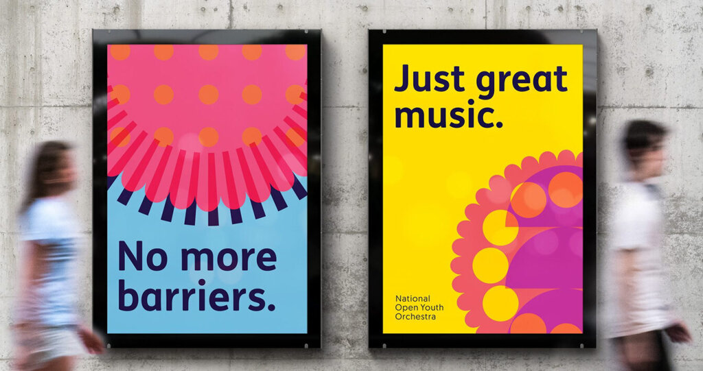
Image and video
Avoid autoplay
Ensure your moving image is optional. Flickering advertisements, scrolling updates and GIFs can be a real distraction for people with ADHD and autism. When creating a new brand and website for Bristol Climate & Nature Partnership to communicate an updated commitment to climate, nature and people, the brand and website had to be sector agnostic — that is, not designed for one particular industry. Accessibility was a big consideration in the design in terms of image and video, type choices and illustration style.
Captions and transcripts
Provide transcripts for audio content to support those with hearing challenges and benefit neurodivergent individuals who prefer reading over listening. Captions help users with hearing impairments and enable videos to be watched in any setting.
Alternative text for images
Descriptive and accurate alternative text allows users with visual impairments, or those using screen readers to fully engage with the content on your website.
User experience
Predictable navigation and interaction
Design a navigation system that is predictable and consistent to help neurodiverse people follow and understand the layout of your website. This approach eases mental effort and makes your website much more user-friendly.
When creating a new website for Gather Round, a creative community with its people at the heart of the brand, we ensured buttons were almost always a minimum of 40px in height for easy user interaction. Additionally, our baseline body text was consistently larger than 16pt to maximise readability.
Sensory
Reduce noise and distraction
Reduce visual overload by incorporating ample white space, limit the use of auto-playing videos and background music and make sure any necessary animations are subtle and can be easily disabled by the user. Users with ADHD and autism can find it challenging to focus when confronted with unexpected noise or distracting elements.
Error feedback
Use gentle, constructive language that clearly explains an error and offers guidance on how to resolve it. Avoid using alarming colours or symbols that can cause anxiety. For example, instead of a dramatic “ERROR INCORRECT PASSWORD” try “Hmm, that password doesn’t seem to match. Let’s try again!” This approach helps maintain a calm and encouraging environment, allowing users to navigate errors without added stress.
Tools for Accessibility
At Fiasco, our designers utilise a range of tools to ensure we maximise accessibility in all areas. We rely on screen readers to label interactive elements and ensure accessibility. Alt text is a crucial part of our design process, providing descriptive content for every image. Helpful sites like WAVE test and evaluate our designs, whilst ensuring all our work is up to an AA standard. This commitment to accessibility is our baseline, irrespective of specific client requirements.
We recognise that our own website doesn’t fully reflect the accessibility and design standards we set for our clients. We’re currently in the process of updating it to match the high standards we consistently deliver, ensuring that our site is as accessible and user-friendly as the work we produce for others.
By embracing these principles, we can create a more inclusive and engaging digital experience. Accessibility doesn’t mean generic or dull, nor does it mean compromising on design or creativity.
Written By

Nathalie Crease