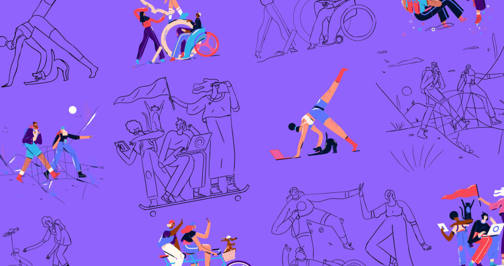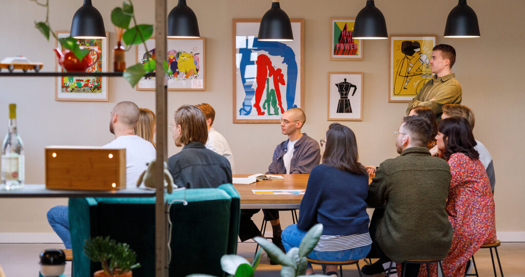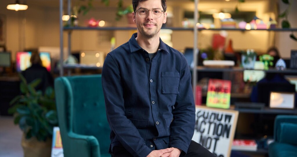
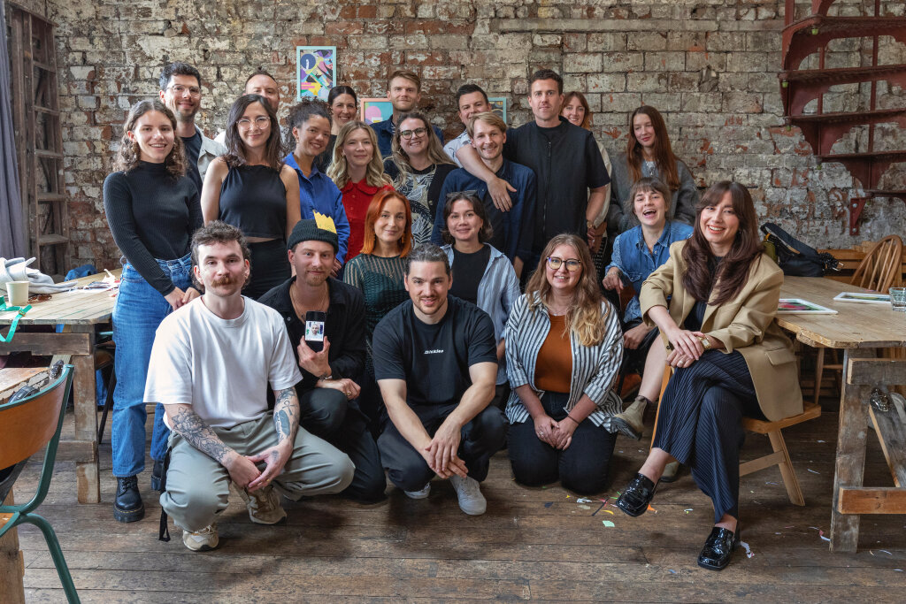
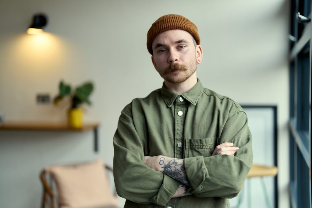
Making space for curiosity and creativity
Culture
13 mins


Thoughts, news and opinions from the studio


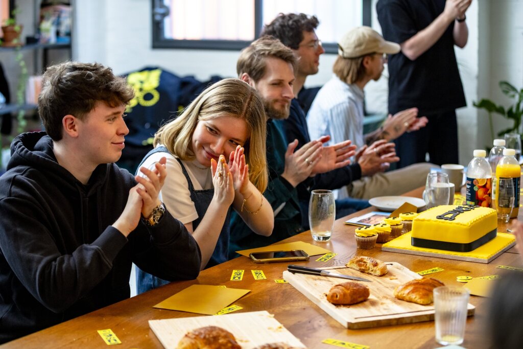


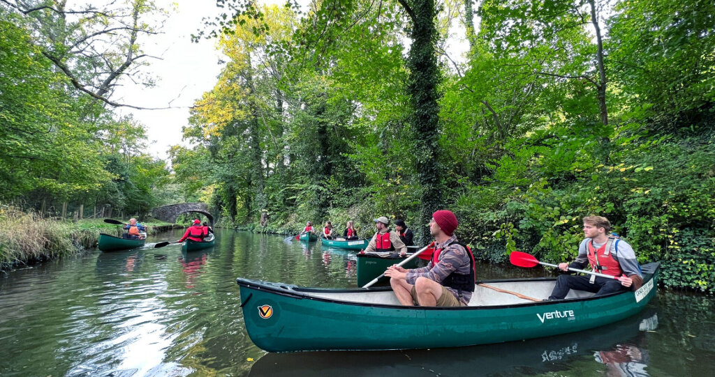
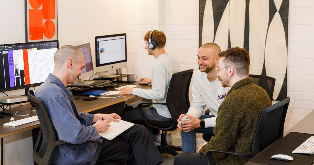
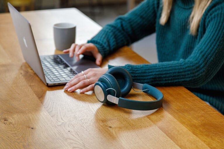
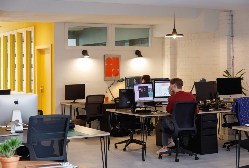
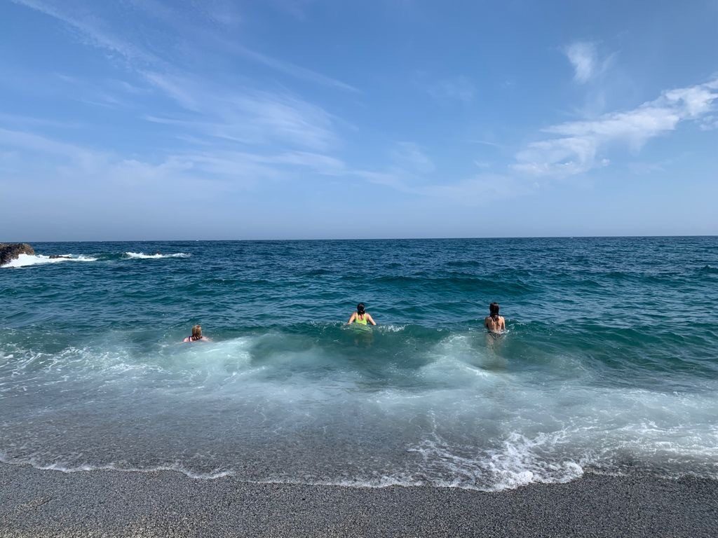
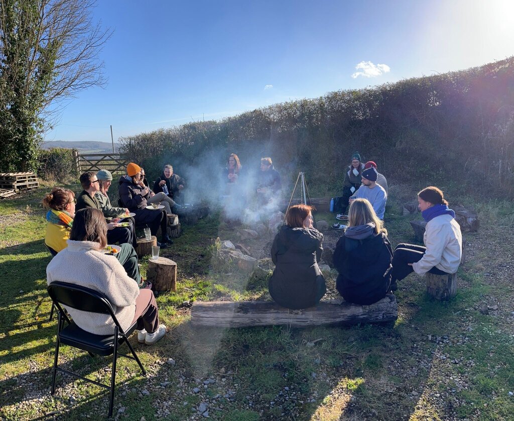
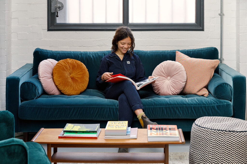
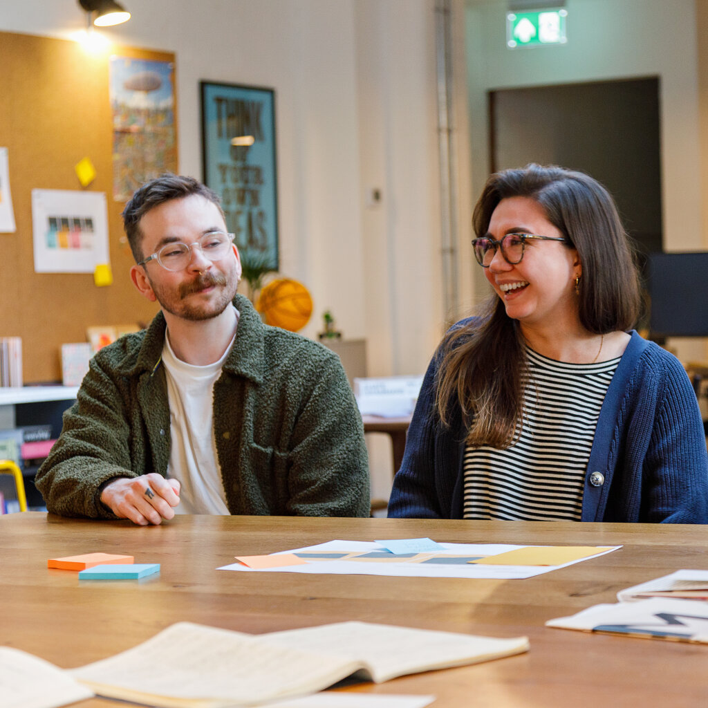
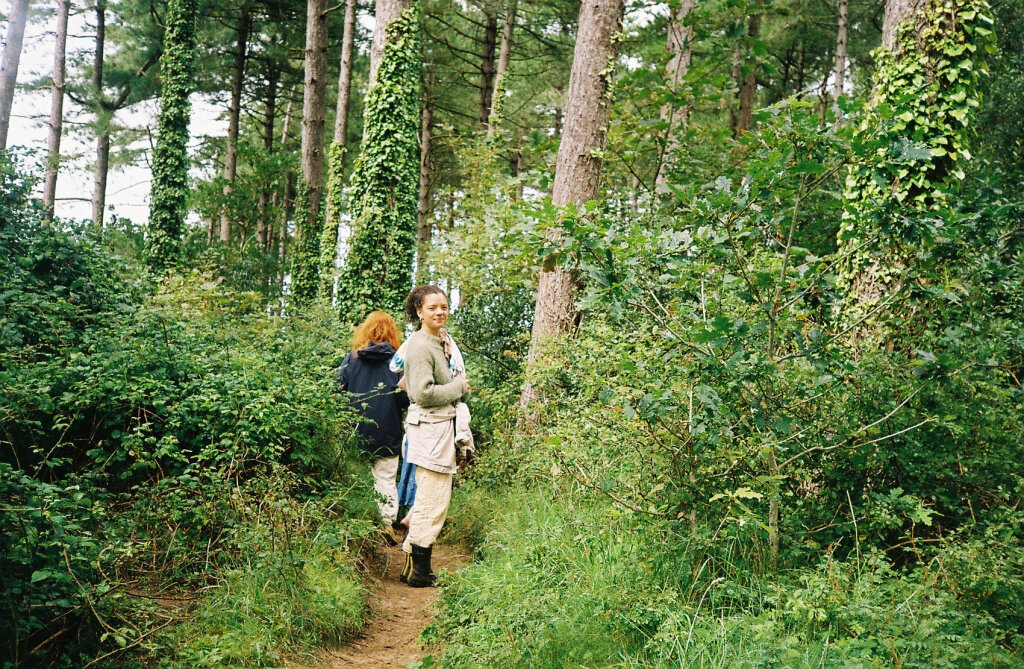
At Fiasco, we believe in making space — not just physically, but mentally too. Space to step away from the everyday rhythm of work. To rediscover what brings us joy. To pause, take a breath, and reset. One way we…

Why are so many design agencies rebranding right now?
from Design Week

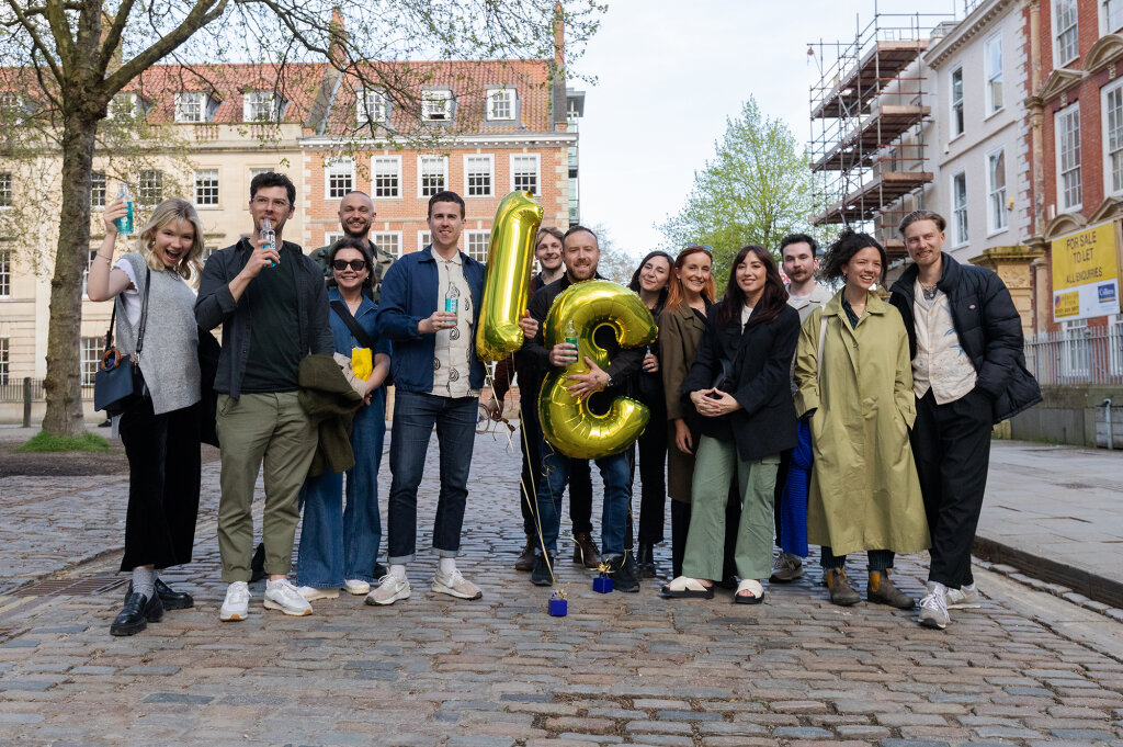
Fiasco marks 15 years in design with a feelings-first rebrand
from Creative Boom
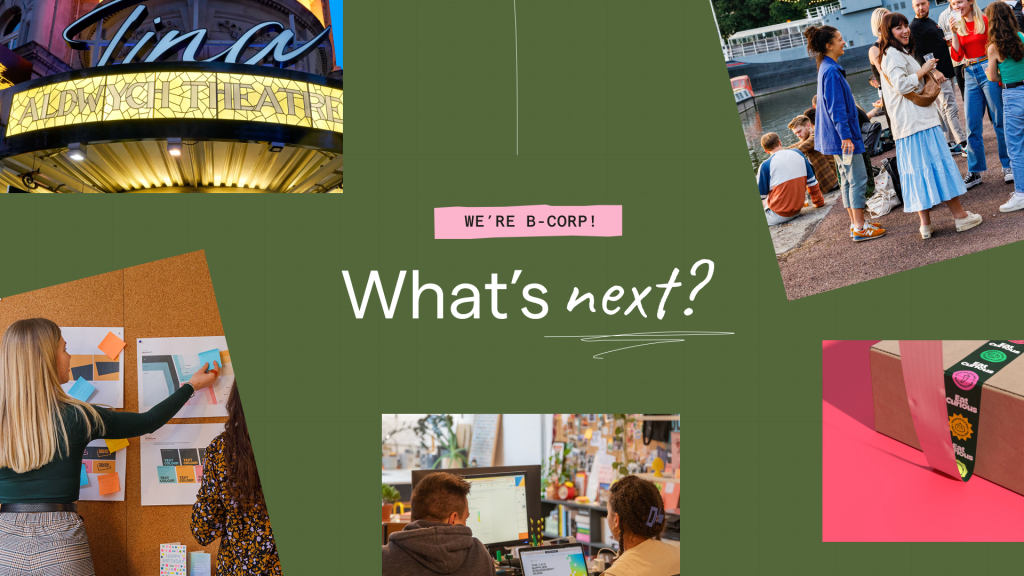
Fiasco’s new identity for Nederlander Theatres
from Design Week

New Visual Identity for Gather Round by Fiasco Design
from Brand New


New Logo and Identity for Eat Curious by Fiasco Design
from Brand New
Fiasco gives new meaning to volunteering, with its branding for OnHand app
from Creative Boom

Fiasco Design's new identity for education provider Bayswater
from Creative Boom