iO Academy

A new brand for award-winning coding academy with inclusivity at its heart

It’s no great secret that there is a representation gap in the tech community. iO Academy is on a mission to help to address the imbalance within the industry, and give all people the training they need for a career they’ll love. With graduates working in tech companies from Bath to Berlin, a 50:50 ratio of men and women trainers, and creating an environment that facilitates opportunities, iO Academy are driven by a desire to diversify the tech industry.  

The Academy – previously Mayden Academy reached out to us at the start of 2020 with a view to repositioning the company, with a full strategic review of the name, proposition and branding. They came to us knowing that their brand identity was out of place with their current position and direction. Having spent time analysing student perceptions and market position they wanted to promote a more inclusive and innovative brand that appealed to prospective students of all genders and backgrounds, breaking down negative perceptions surrounding the industry.

They also wanted to position the brand independently of the parent company – Mayden, from which the company was born.

UX Design Website Development UI Design Copywriting Discovery Brand Strategy Visual Identity Illustration Collateral Digital Strategy
iO Academy brand idea. The words 'Limitless possibilities' are written in violet purple in Space Grotesk Bold type on a white background. There are a few simple graphic elements next to the words, consisting of red circles (coloured in or outlined) and a yellow 'x'.

Brand idea

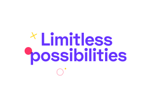
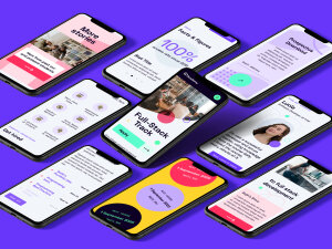
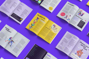
Based on the Academy’s ambitions to change the industry and a belief that a career for tech is for anyone, we came up with the central idea of ‘Limitless Possibilities’ which would define and inspire the visual language for the brand.

iO Academy typography. A split image showing two cropped typographic samples. The left features the 'Space Grotesk Bold' in violet purple on an energy green background, with details of it's usage underneath. The right features a cropped detail of the 'JetBrains Mono' typeface and usage in energy green on a violet purple background.

Visual identity

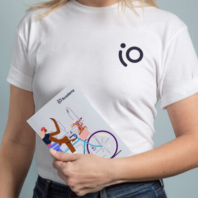
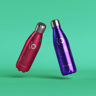
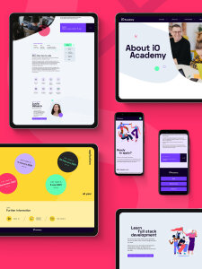
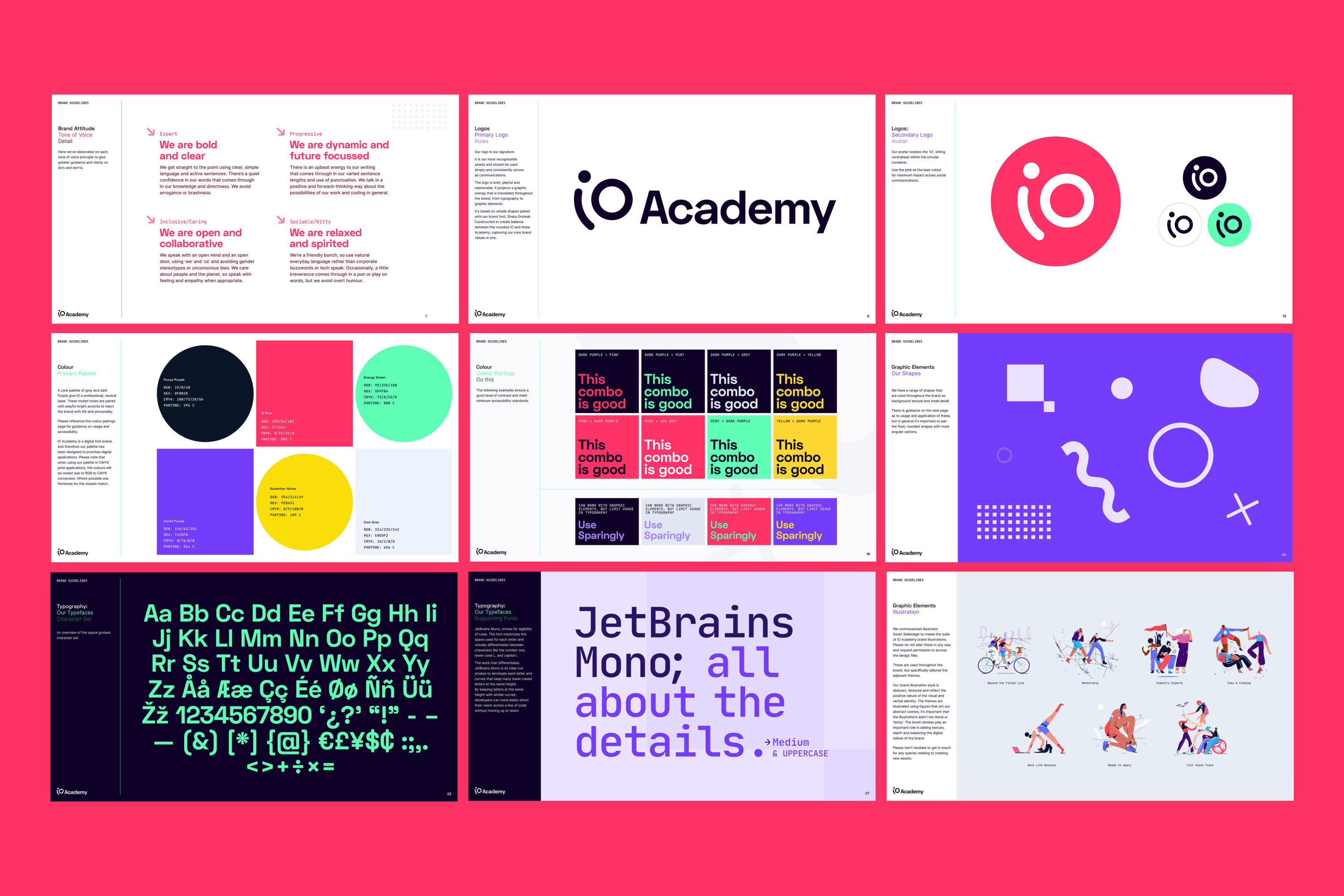
The visual identity is designed to reflect exploration, harnessing imagination and working towards a better future. The graphic shapes give a sense of discovery; collecting badges and developing new skills along a creative pathway.

The typography and colour palette is designed to have an inherently digital feel, whilst imbuing a warmth and positivity. Particular focus was also paid to accessibility.

While verbally, the tone is positive, ambitious, empowering, and speaks to the curious and willing.

iO Academy illustrations. Six illustrations are shown on a cool grey background. The illustrations feature people doing different activities - cycling in tandem, yoga, walking, or hover-boarding. The illustrations represent all types of people - they have varied hair and skin colours, one person sits in a wheelchair. Their clothing has tones of blue, purple, pink and red. They often interact with each other and are sometimes shown using laptops or tablet devices, with animals or within landscapes. It is a joyful illustrative style, creating a sense of movement and inclusivity.

Illustration

We worked with illustrator Soren Selleslagh, to create a suite of illustrations to depict aspects of the student journey across the course and into their new careers.

Soren’s human-centred approach evokes joy and empowerment through positive representation of all types of people. With a devoted outlook to making meaningful illustrations, this partnership gave the brand identity the visual storytelling elements that demonstrate openness and inclusivity.

We wanted to become more attractive and accessible to a wider range of people, with a core focus on diversity and inclusivity. Working in an industry that often seems intimidating, this was a challenge.

Margaret Davidson, Marketing Manager, iO Academy

iO Academy IPhone Twitter mock up. An iPhone is placed on a violet purple background. A Twitter home screen interface is shown with the iO logo in the top left. The logo features a curved lowercase white 'i' and an uppercase 'O' on a pink background. The header image features a figure with black hair, white top and blue shorts doing yoga whilst looking at a laptop. A dog mimics the pose. A white headline reads 'Build your future in tech'. Details about the iO Academy are shown underneath, with contact information and number of followers. A tweet is shown in a pink box with a student quote inside. To the left of the phone there is a banner-style desktop view featuring the Twitter interface at the top (menu, search bar) and bottom (tweets, followers, Edit profile button). The same illustration features (as above) on a pale grey and white background. The 'Build your future in tech' headline is repeated here in pink, with a close up of the iO logo underneath it.
iO Academy illustration. The illustrations features a group of people in a circle. They represent a diverse group of people, they have varied hair and skin colours, their clothing has tones of blue, purple, pink and red. Circular and square graphic elements also feature.
iO Academy t-shirt and notebook mock up. A woman with blond hair, white t-shirt and blue jeans is holding a notebook. Only her torso is in view. The white t-shirt has the iO logo on the right side. The logo features a curved lower case 'i' and and uppercase 'O'. The notebook features a crop of an illustration on a pale grey background. It portrays a woman on a blue bike, looking at her phone. A dog sits in the basket. It is a joyful illustrative style, creating a sense of movement and inclusivity. The iO academy logo and wordmark is in the top right corner. iO Academy water bottle mock up. The image features two metallic water bottles floating at an angle against a green background. The left bottle is red, the right, purple. Both have silver lids and feature the iO logo and graphic elements (outlined circles, dots and x-shapes).
iO Academy 6-sheet urban mock up. Four 6-sheet adverts are shown in an urban setting with concrete pavement and graffiti. The iO Academy logo is prominent on each. The logo features a curved lower case 'i' and and uppercase 'O'. The wordmark is in sentence case in Sharp Grotesk. The adverts either feature a headline, hero illustration, or image cropped within a circular shape. The illustration features a group of people hover-boarding. They represent a diverse group of people, they have varied hair and skin colours, their clothing has tones of blue, purple, pink and red. They are using a laptop and tablet device. A 'Discover how' call to action and weblink features in addition to circular and x-shaped graphic elements.
iO Academy mobile phone screens mock up. A group of angled mobile phone screens is shown on a purple background. The screens show different examples of the mobile interface, including imagery, headline text. icons and action buttons in purple, iO pink or energy green. The backgrounds are largely white, some are purple or yellow. There are some circular and curved line graphic elements. The iO logo is shown in white at the top of the central screen against a dark purple background. The logo features a curved lower case 'i' and and uppercase 'O'. The wordmark is in sentence case in Sharp Grotesk.
iO Academy prospectus mock up. A range of double-page spreads are shown on a purple background. The layouts feature headlines such as 'Inclusion', or 'Student life'. Text is arranged in one or two columns, the subheadings in purple. Certain sections are highlighted within white or dark purple text boxes or circles. Some page layouts feature illustrations showing people doing different activities - cycling in tandem, yoga, walking, or hover-boarding. The illustrations represent all types of people - they have varied hair and skin colours, one person sits in a wheelchair. Their clothing has tones of blue, purple, pink and red. They often interact with each other and are sometimes shown using laptops or tablet devices, with animals or within landscapes. It is a joyful illustrative style, creating a sense of movement and inclusivity. There are a small number of circular and x-shaped graphic elements.
iO Academy brand guidelines. A 3x3 grid layout on an iO pink background includes various elements of the iO Academy visual and verbal identity: tone of voice, logo, colour palette (including colour pairings), graphic elements (fluid, rounded or more angular shapes), typefaces and illustration style.

Fiasco saw right to the heart of who we are as a brand and came up with a visual identity and approach where we now feel confident that an underpinning of inspiring inclusivity will be clear in everything we do, and help us to be part of bringing meaningful change.

Margaret Davidson, Growth Manager, iO Academy

What's Next?