
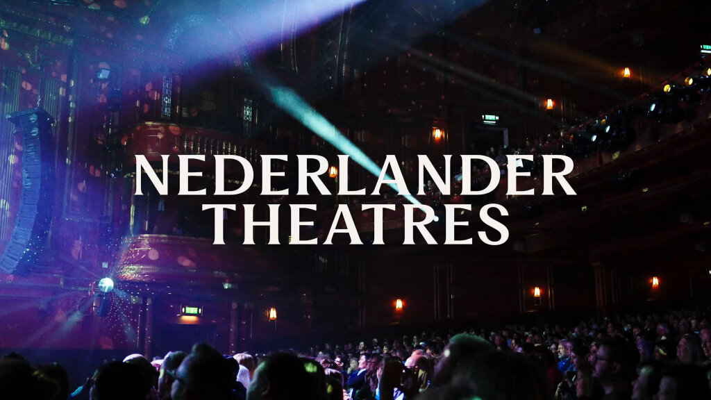
Nederlander Theatres
Elevating a century-old theatre group with a brand built to take centre stage
From the studio
Fiasco team titbits, delivered fresh to your inbox every Friday at 4pm. Want in? Drop your email below, and we’ll see you Friday.
Aperol and Prosecco Peach Fizz by Booths
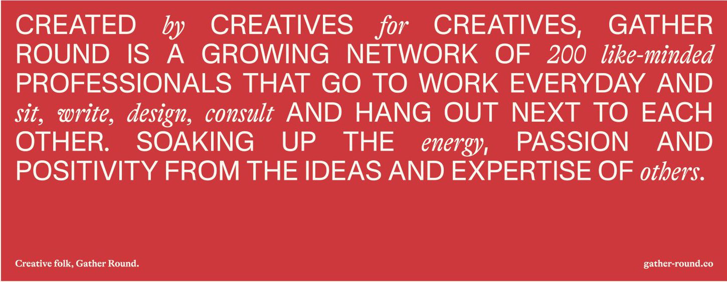
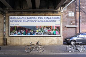
Designed by creatives for creatives, Gather Round is a growing network of 220+ like-minded professionals that go to work everyday and sit, write, design, consult and hang out next to each other.
Soaking up the energy, passion and positivity from the ideas and expertise of other creative folk.
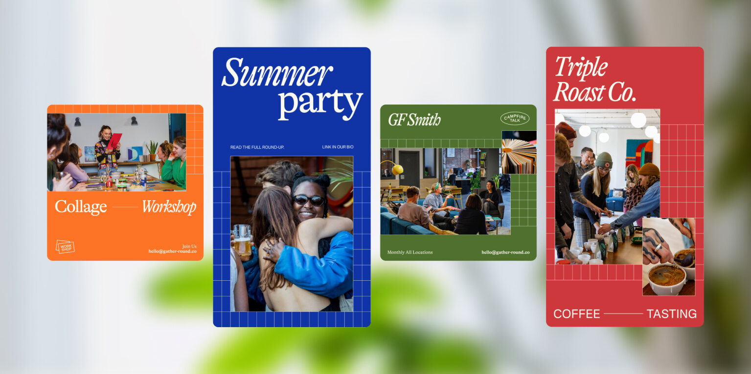
Co-working is an increasingly saturated market. With new spaces popping up all the time, it was time for Gather Round to highlight its genuine point of difference: creative community.
With two sites in Bristol — and a third on the horizon, Gather Round tasked us with creating an expansive brand toolkit that could convey the bustling nature of a growing, diverse creative community.
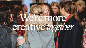
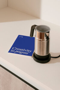
The refreshed brand is organised under the strategic banner of ‘we’re more creative together’. With the intention of shifting the proposition towards more of a lifestyle offering, the new strategy puts the emphasis on community first, and co-working second.

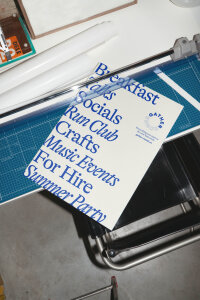
With such a diverse offering, we wanted a typographic system that would work hard to carry that message. Pairing serif (GT Alpina) and san serif (Nacelle) gives the identity a nostalgic tinge whilst still feeling fresh and current.
A bold, confident new colour palette grants the freedom to express the brand in a more playful, energetic way that talks directly to an audience of creative professionals.
Always with the creative audience in mind, we chose two typefaces that – when combined, toe the line between creative flair and accessibility.
Creative flair and accessibility


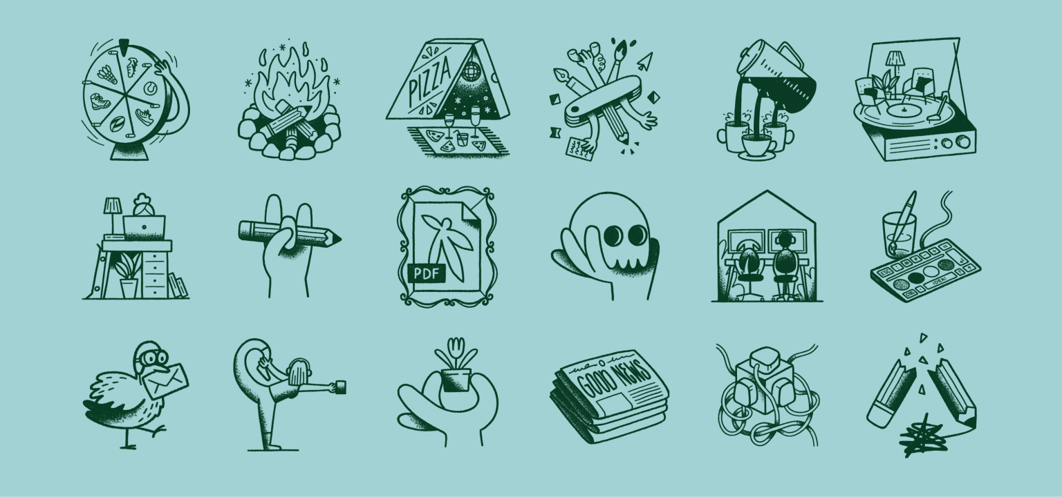
Elsewhere, slightly surreal illustrative elements inject moments of wit and imagination into the branding. This adds much-needed moments of charm and wit to what otherwise might be functional areas of the Gather Round experience.

Alongside the new brand we designed and built a new digital home that helps to establish the brand positioning as more than just a place to work.
Designed for an audience of creative professionals, the website has been meticulously crafted to excite and inspire.
Every element, from thoughtful messaging to playful interactions has been designed to offer moments of joy, whilst acting as a window into the Gather Round community.
A window to the community
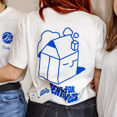
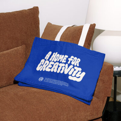
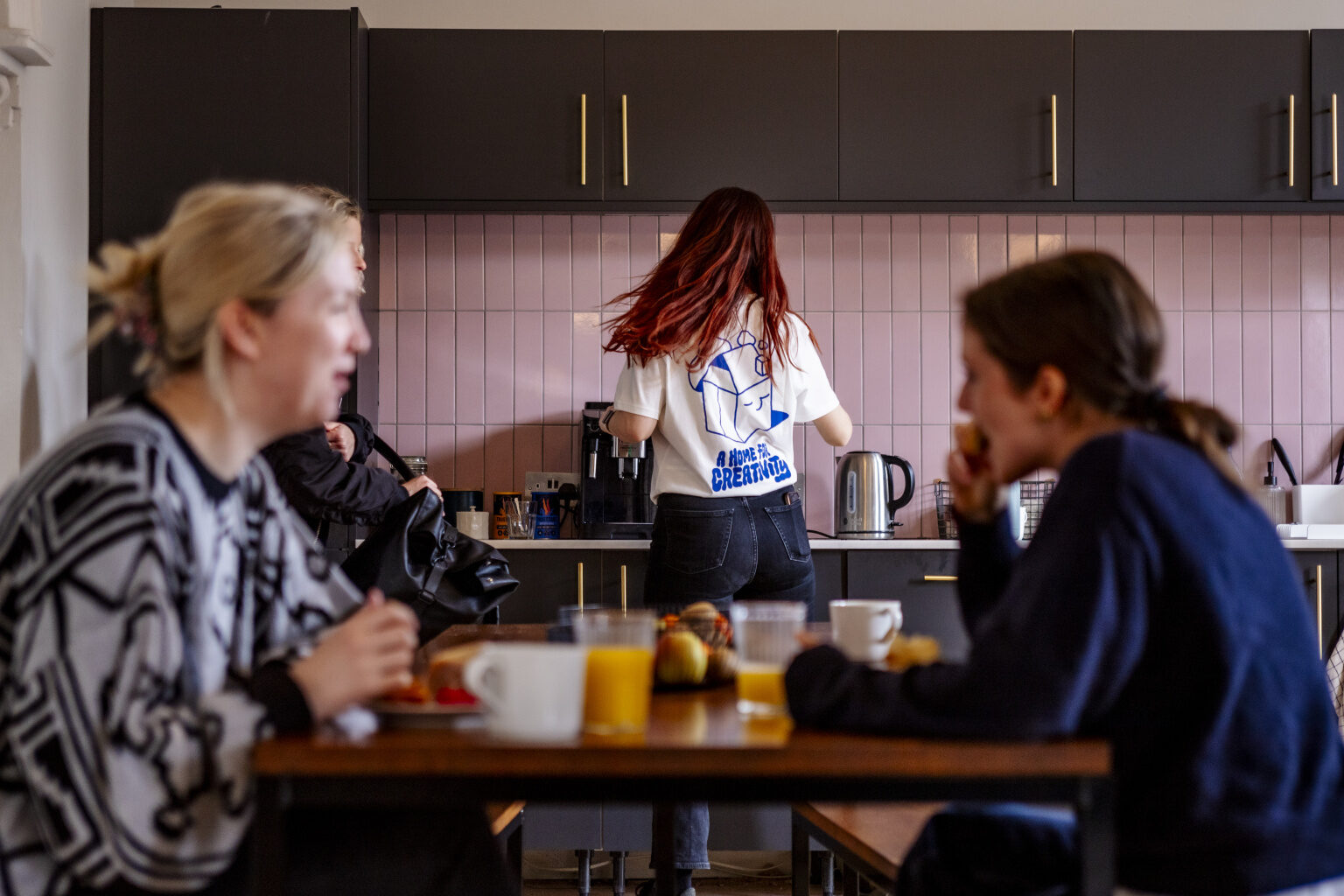
In an effort to further amp up the brand’s lifestyle feel, we commissioned local illustrator Con McHugh to produce a line of t-shirts. Intended to reflect streetwear trends, the merch was designed to make people feel and look good whether they’re inside Gather Round or out and about in the city.
Working with Fiasco on the rebrand has been like having a seamless extension of our team. Fiasco delved deep into the essence of what it means to be a member and ran with it to create our new look, consistently delivering on time and within budget. We're delighted with the result, we feel this process has truly leveraged our brand and they are an absolute pleasure to work with!
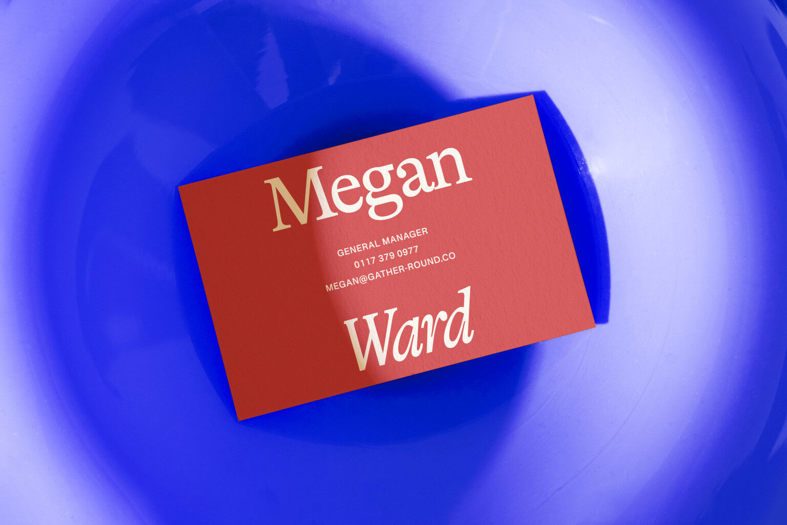
Danie Stinchcombe, Marketing Director, Gather Round
Elevating a century-old theatre group with a brand built to take centre stage

Powering up the brand experience for pioneers of zero-emissions flight