
Vertical
Powering up the brand experience for pioneers of zero-emissions flight
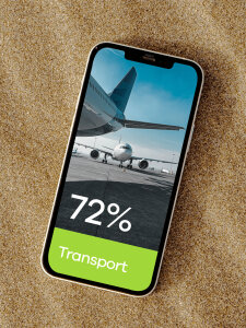
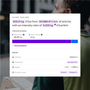
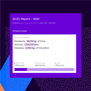
Pledge is one of the fastest growing sustainability tech startups in the UK. Their online platform makes it simple for businesses of any size to understand and address their impact on the planet.
By embedding sustainability into business, Pledge helps companies take the climate action that is urgently needed.
Acting on climate impact can be a complex and bewildering task. What people need is clarity and a simple pathway to action. Here, Pledge acts as a one-stop shop for businesses to measure, reduce, and off-set their carbon footprint.
As businesses around the world increasingly look to expand their sustainability efforts, Pledge required a new brand identity to better reflect the benefits and opportunities that corporate responsibility presents. The challenge therefore was to create a robust and flexible visual system to be used across channels for a cohesive brand experience.
Working closely with the team at Pledge, we came up with the idea of ‘cutting carbon confusion’ to help guide the creative development of the brand and its various touch points.
The concept is focused on simplifying the often confusing topics of sustainability into something that feels tangible and achievable.
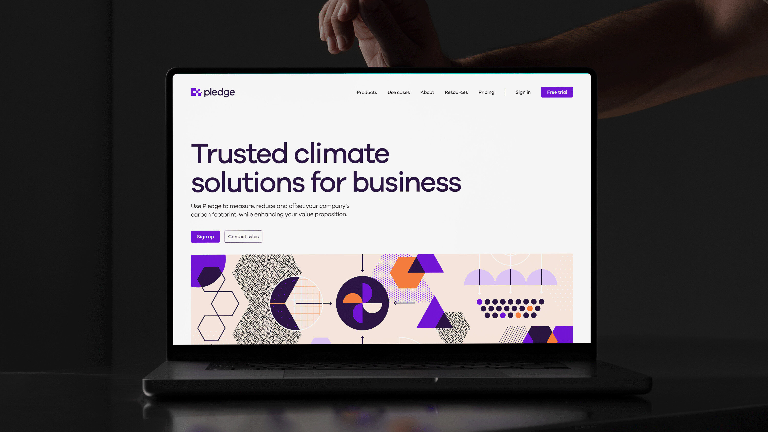
The new identity includes a modernised, scalable logo, which visually represents the idea of carbon reduction. Additionally, the updated colour palette adds a sense of warmth and positivity, whilst keeping the brand’s distinctive shade of purple.
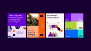
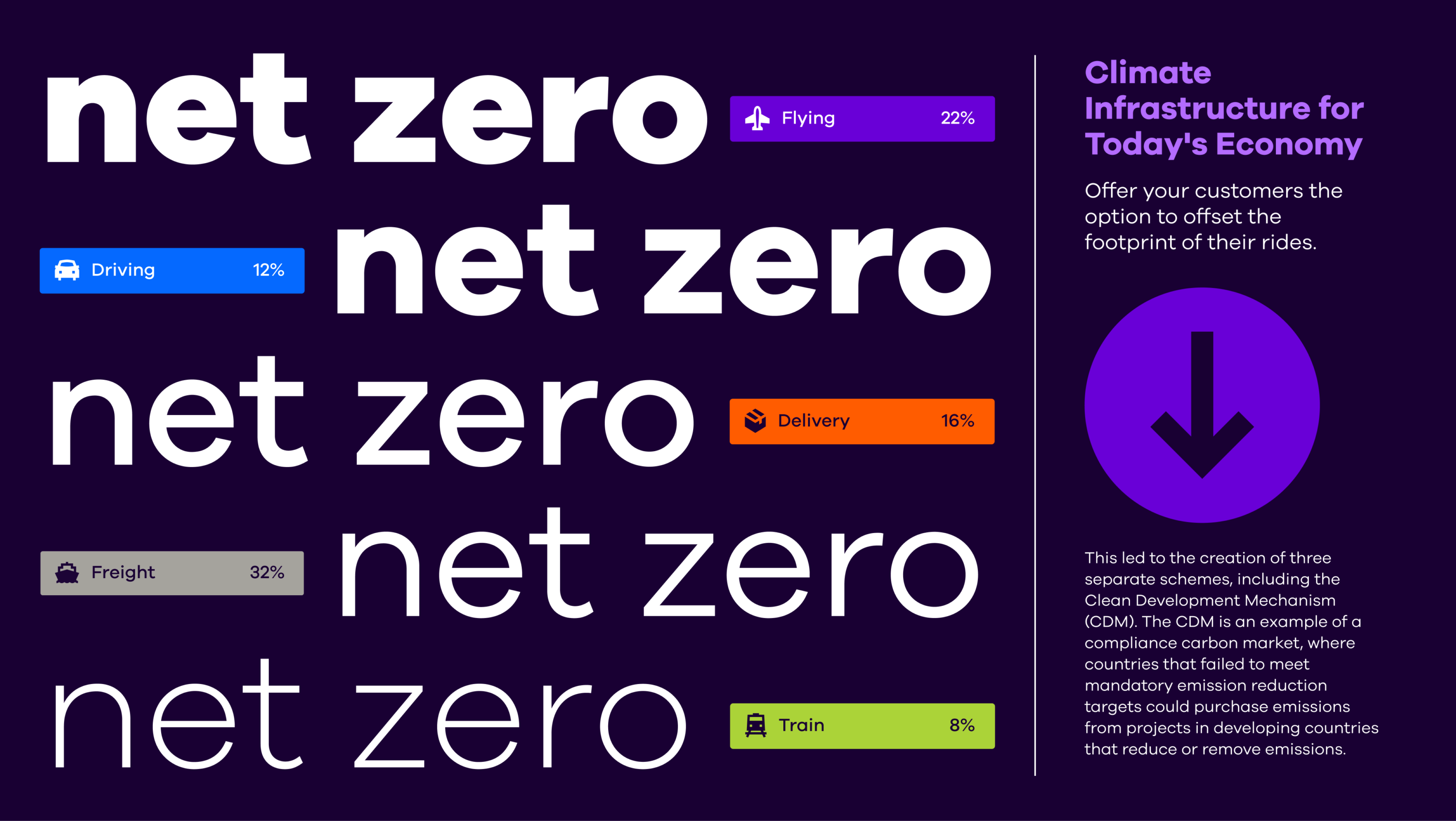
For photography, we wanted a direction that moved away from overused environmental images. Opting instead to play with the effects of distortion, the new imagery suggests the idea of finding clarity through Pledge’s platform. Meanwhile, a suite of conceptual patterns and illustrations aim to explain the big, often complex themes behind sustainability in a more simplified way.


Altogether, the new brand gives Pledge a comprehensive and flexible identity that can be utilised across multiple touch points and develop with them as they grow.
Powering up the brand experience for pioneers of zero-emissions flight
Strategy, naming, visual identity and site for world-first biotech start-up set to transform the future of food