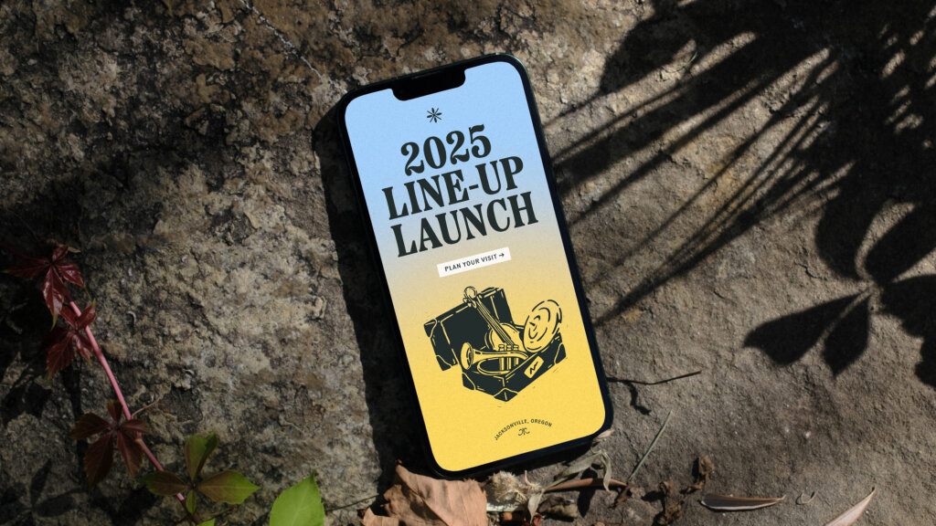
Britt Music & Arts Festival
An identity and digital experience that captures the emotional energy of performance, place, and community
Moshi was originally designed with sleep in mind. Backed by scientific experts, stories are specifically designed to relax and lull kids to sleep using binaural beats and other technologies to help children sleep faster and longer.
More recently, Moshi have expanded their offering to include mindfulness and meditative content, shifting focus from sleep-only to round the clock. This new content includes tracks for times of anxiety, calming down and focusing.
Learning the fundamentals of mindfulness early in life supports cognitive, academic and social-emotional development.
We were brought on board to capture the shift to all-encompassing mindfulness and the transformative effect it can have on childhood mental health. The challenge was to evolve Moshi’s pre-existing identity, brand collateral and website, and capture the magic of the mind.
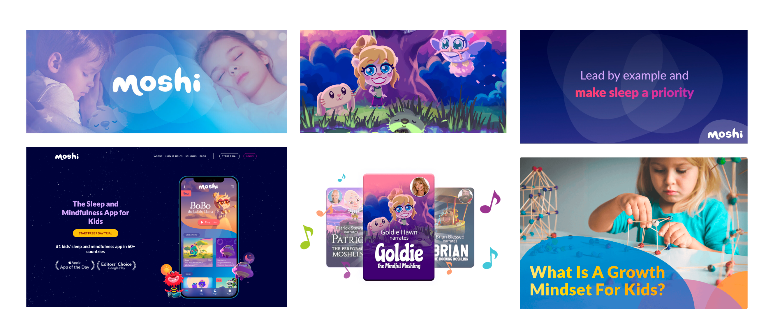
The brand colour palette has been developed to include brighter hues that work harmoniously together and have accessibility in mind.
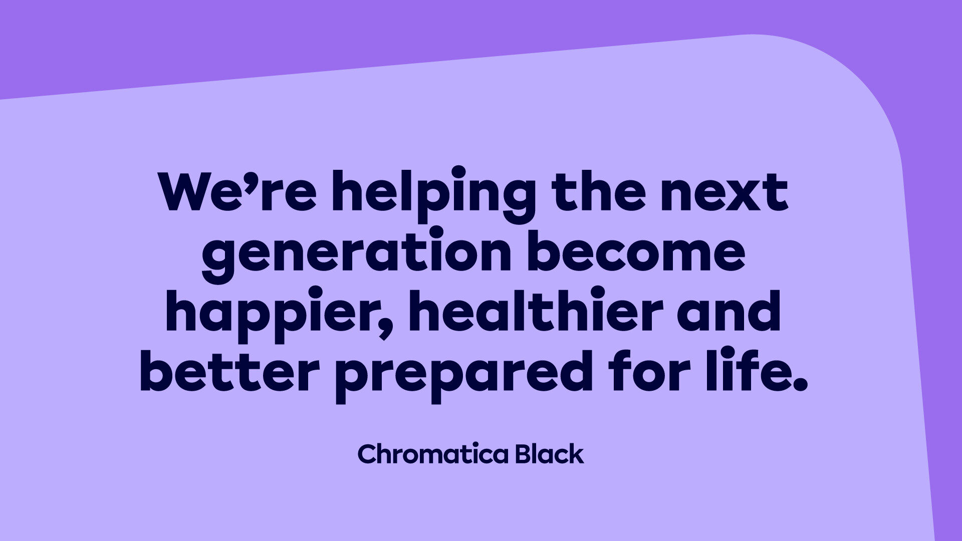
In addition, Calibri has been replaced as the main brand font. In its place is Chromatica by Polytype foundry, a versatile sans serif with a warm and personable tone.
Moshi had previously relied on stock imagery that lacked authenticity and undermined their mission. So it was important that the real-world impact mindfulness has on the next generation was placed front and centre.
Working closely with the in-house team, we developed a tone for the photography that showcases Moshi not only being used, but being thoroughly enjoyed.

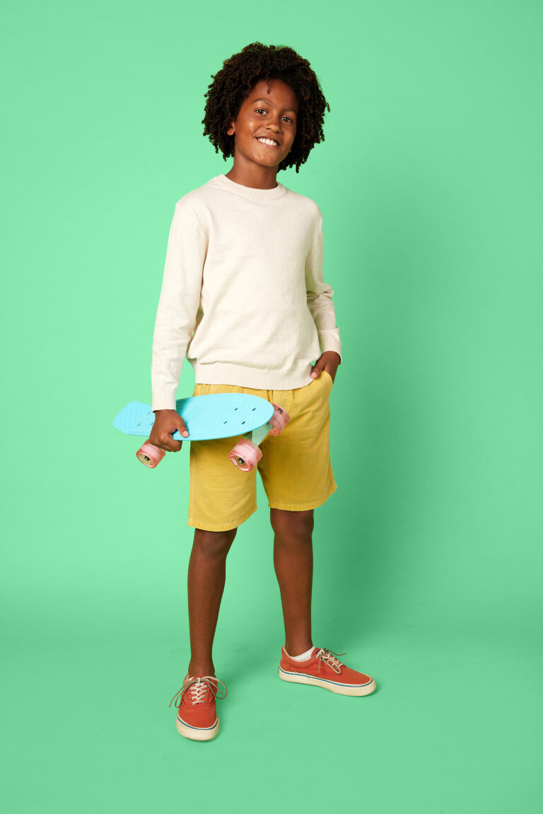


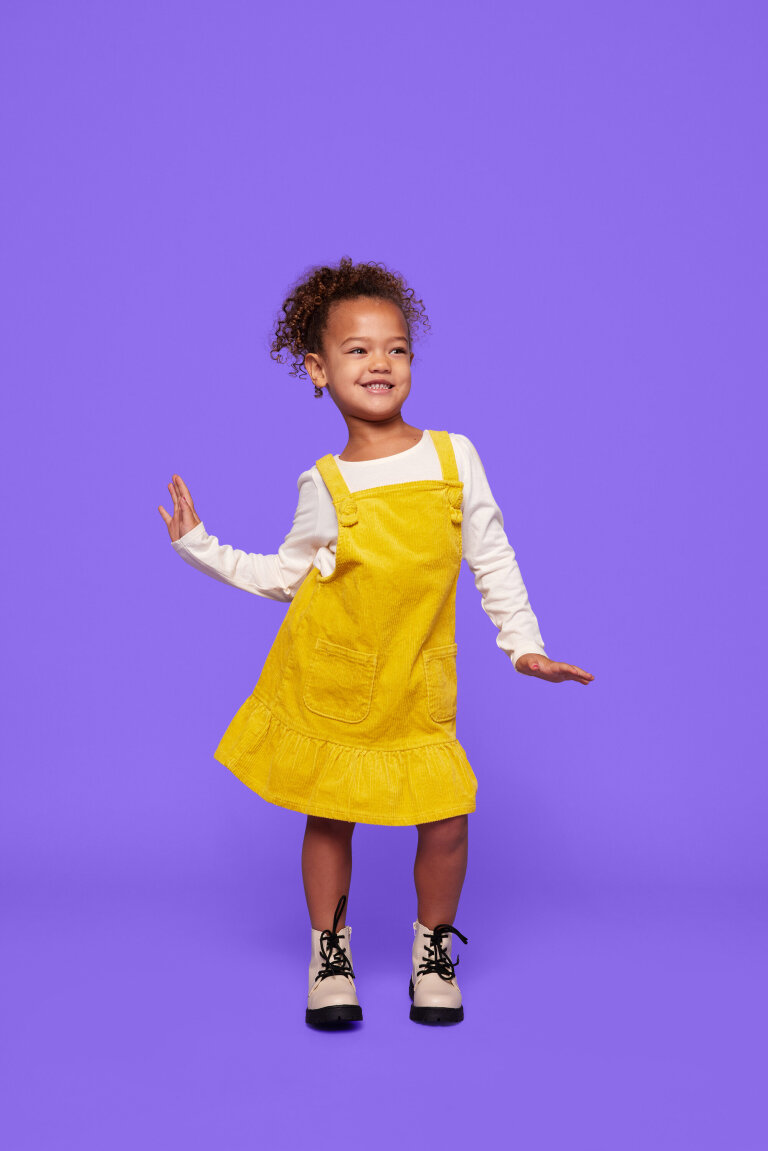

The new photography style is positively vibrant and energetic, using colours from the new brand palette. Images are intended to hero the children and allow them to shine. Additional hand-drawn annotations add a sense of personal expression, as unique as every child.
Photography to hero the child
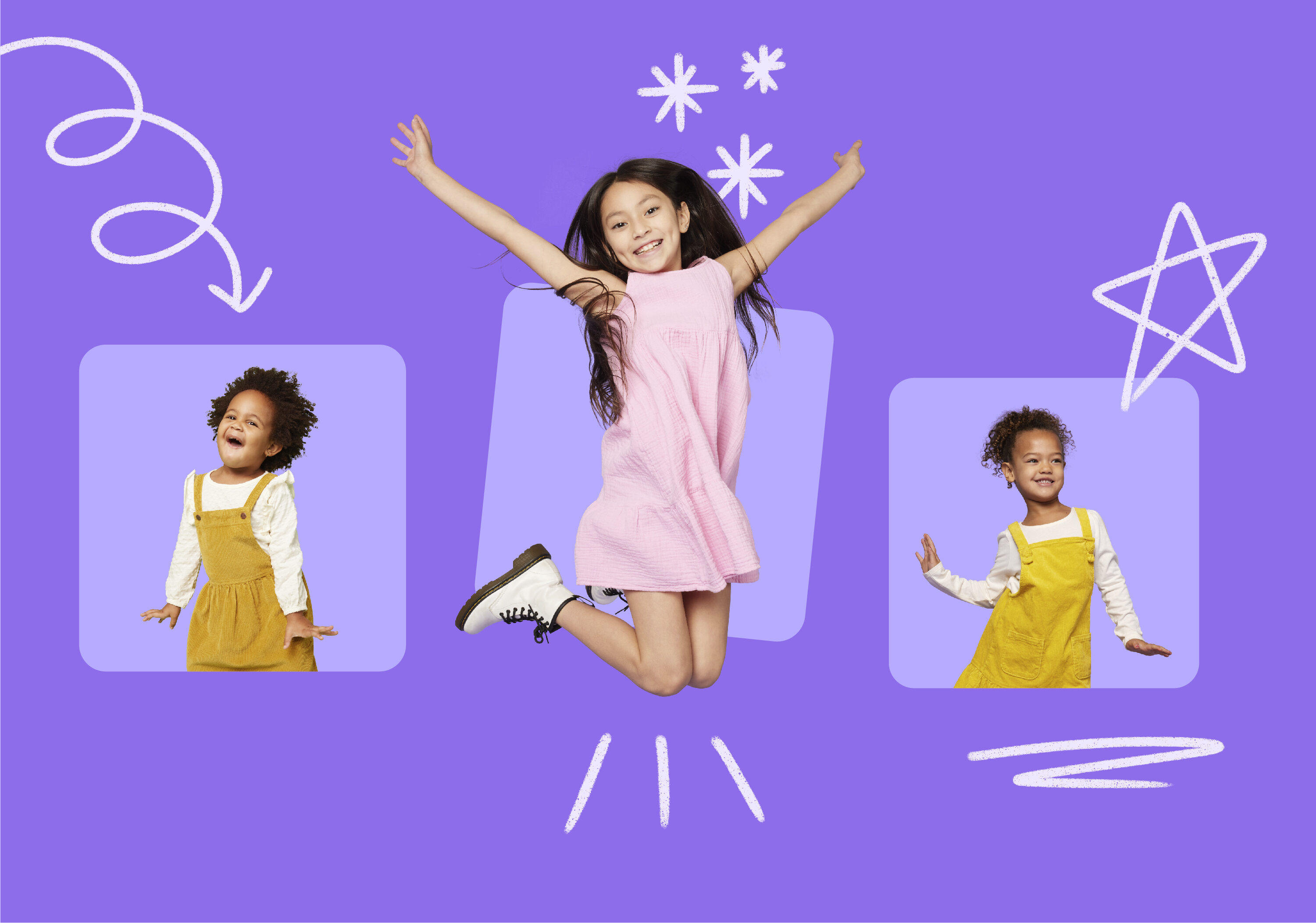
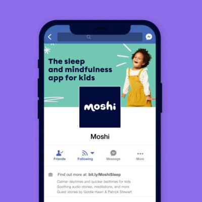
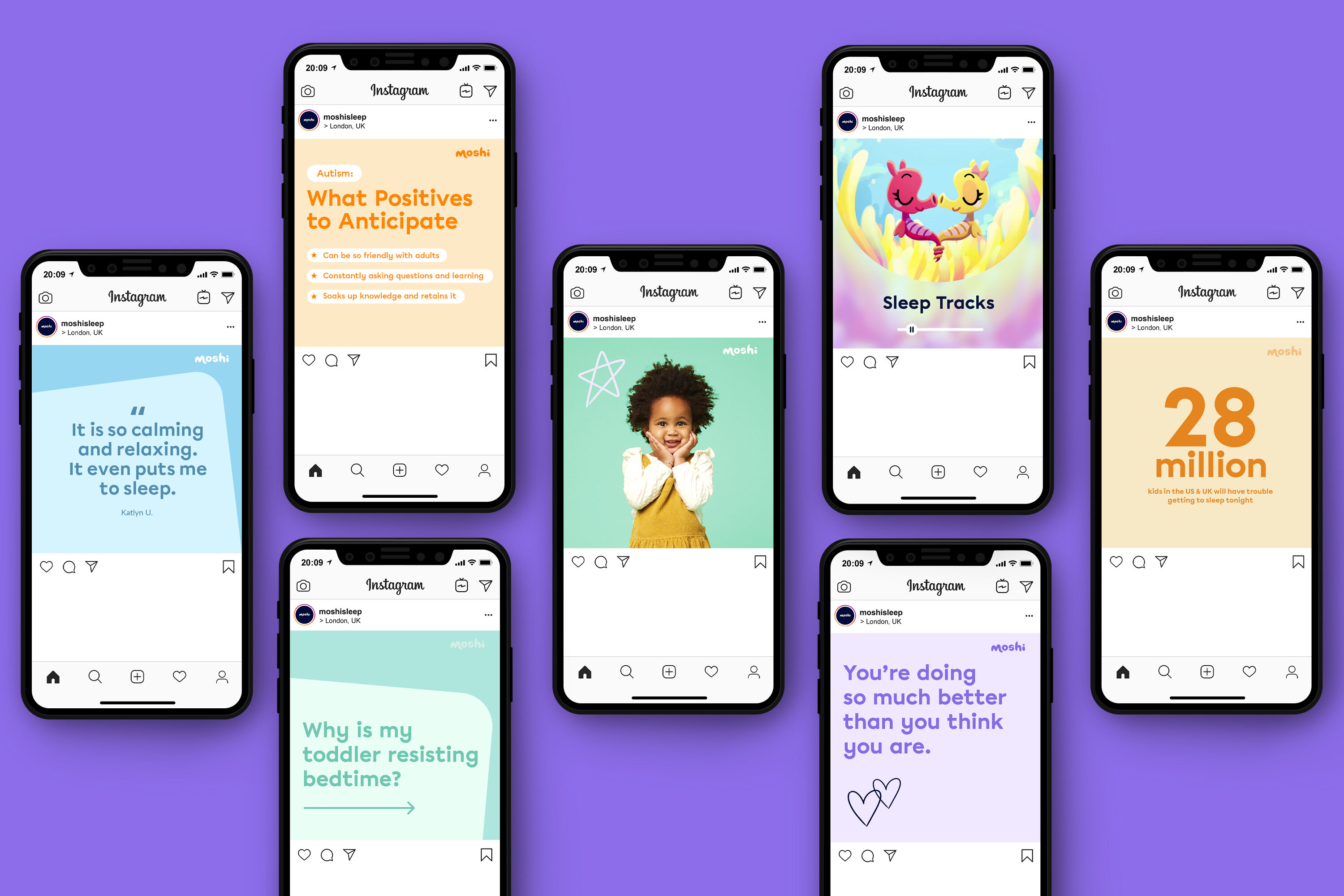
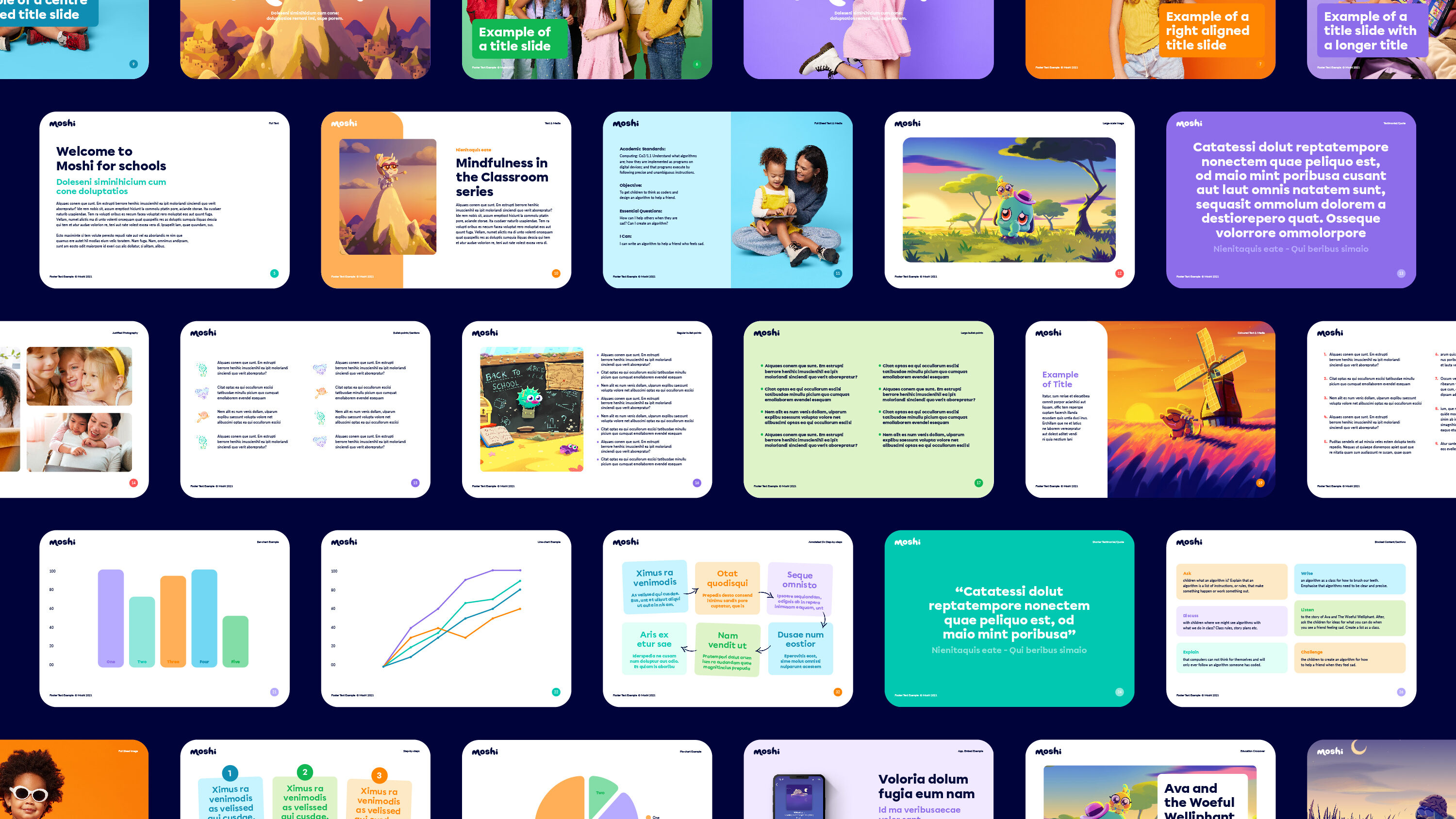
The previous site was limited visually and functionally. Whilst the app had skyrocketed to success, the website had been left behind. It had become difficult for the team at Moshi to make even simple updates.
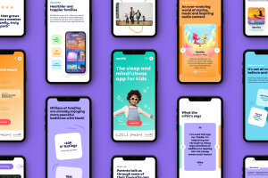
We were tasked with designing a digital home for Moshi that elevated the brand and helped to drive subscriptions to the app. The site had to echo the playful, magical sentiment of the app whilst simultaneously appealing to the decision maker – the subscribing adult.
Along with introducing the new brand styles, we added playful interactions and motion to dial up the Moshi personality. The result is a site that echoes the spirited nature of the app, and champions the child.
Dialling up the Moshi personality
We originally appointed Fiasco to rebuild our website. The project quickly became something much more and led to us sharpening our brand across platforms with the website at the centre. Fiasco were great to work with through the process, managing multiple stakeholders and bringing us to an endpoint that was a true revolution over what existed beforehand. We look forward to working more with them across multiple design projects online and offline.
Ed Barton, COO, Moshi

An identity and digital experience that captures the emotional energy of performance, place, and community

Launching a new brand and website for world-first biotech start-up set to transform the future of food