
Daya
Product-led brand for fintech designed to bring clarity and money confidence to the Portuguese market
From the studio
Fiasco team titbits, delivered fresh to your inbox every Friday at 4pm. Want in? Drop your email below, and we’ll see you Friday.
Aperol and Prosecco Peach Fizz by Booths
Working closely with fintech brand, Luxhub, we were commissioned to create bold new branding and a website that would help to position them as a true pioneer in the open finance market.
Founded in 2018 by four of the major banks in Luxembourg, Luxhub has quickly become a leading European Open Banking API Platform. At the forefront of open finance they are a key proponent of the European financial sector’s evolution towards Open Banking.

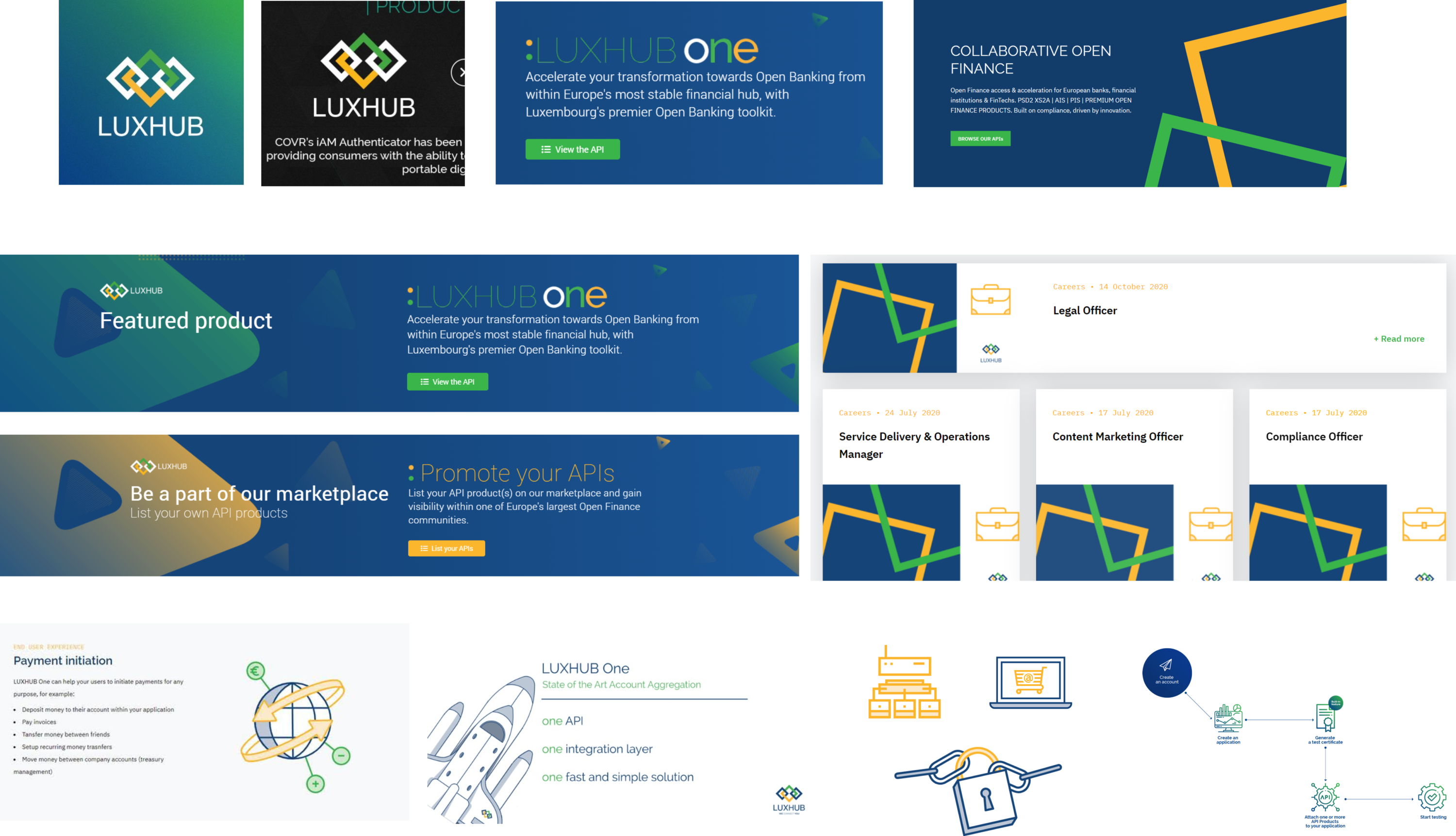
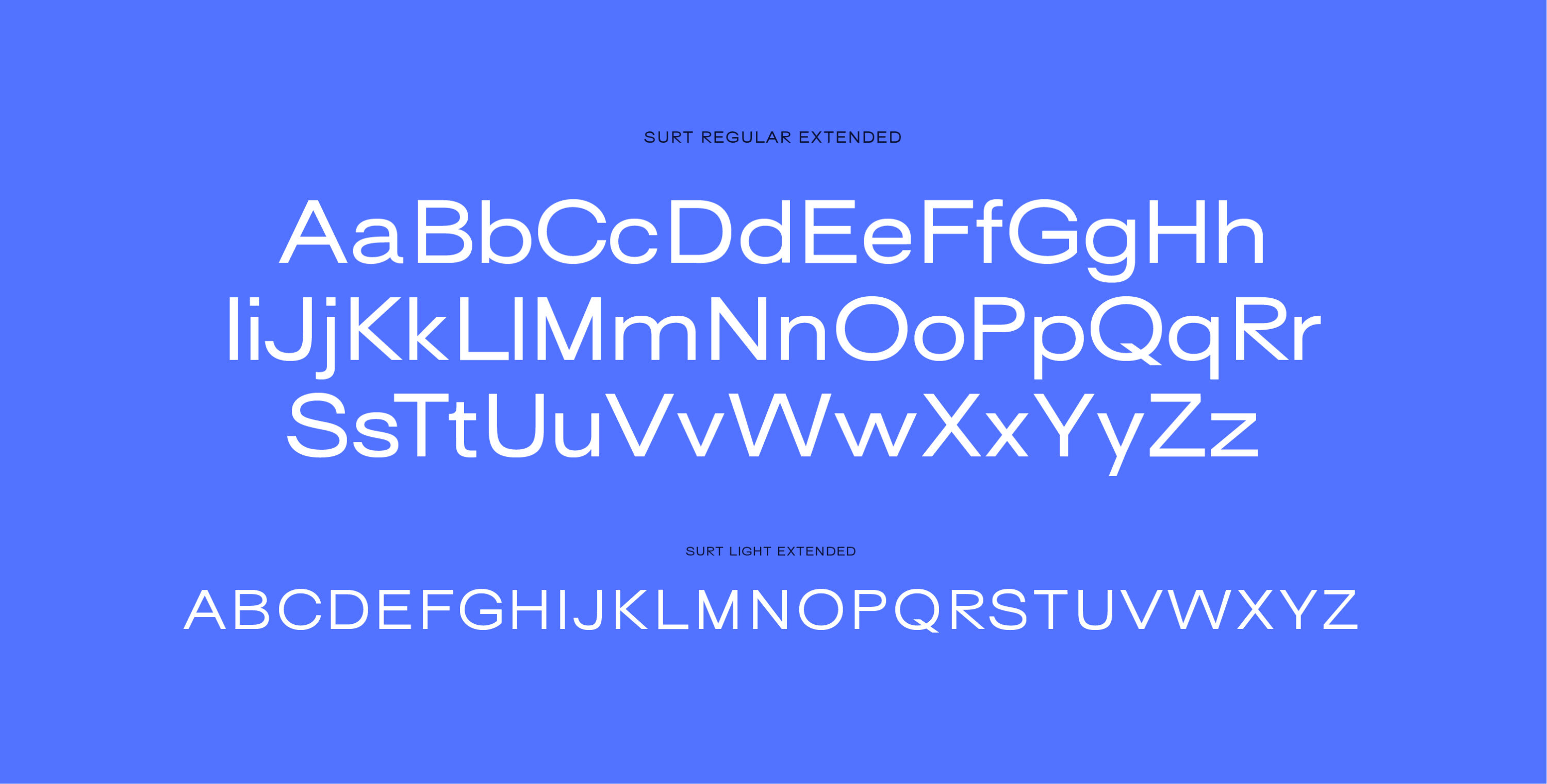
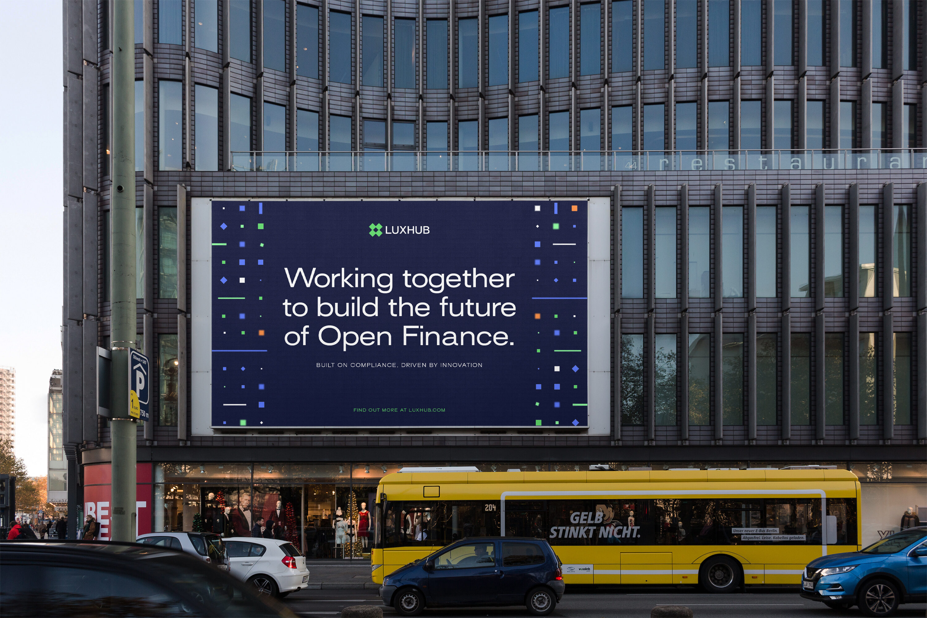
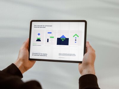
The world of open finance is complex and ever-evolving. We were brought on board to help design a visual identity for the brand that helped to make sense of the world of open finance.
The main objective was to position the business as a leading figure in the open finance sector whilst appealing to a broader, more dynamic customer base across Europe and beyond.
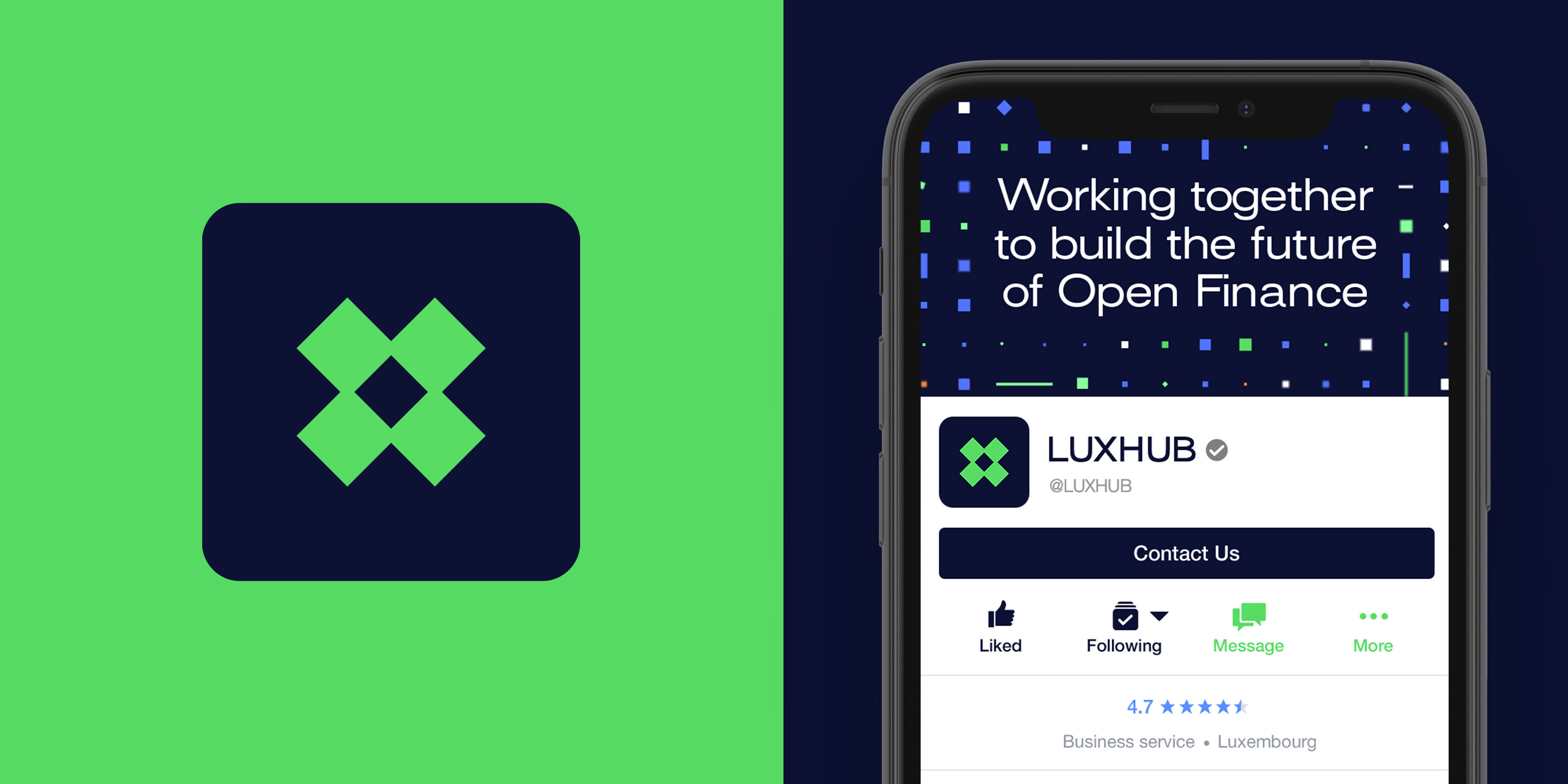
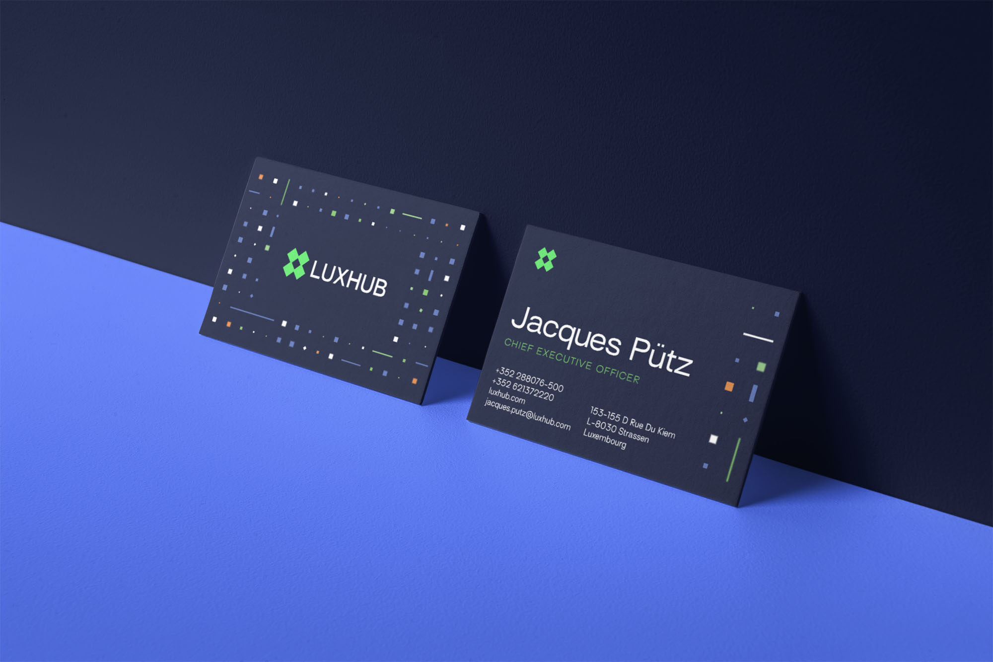
Using the original brand logo as a starting point, we added an extra square to represent the four founding banks and altered the composition of the squares to represent an ‘X’. A strong graphic mark that implies connectivity with the interior negative space – representing a central hub.
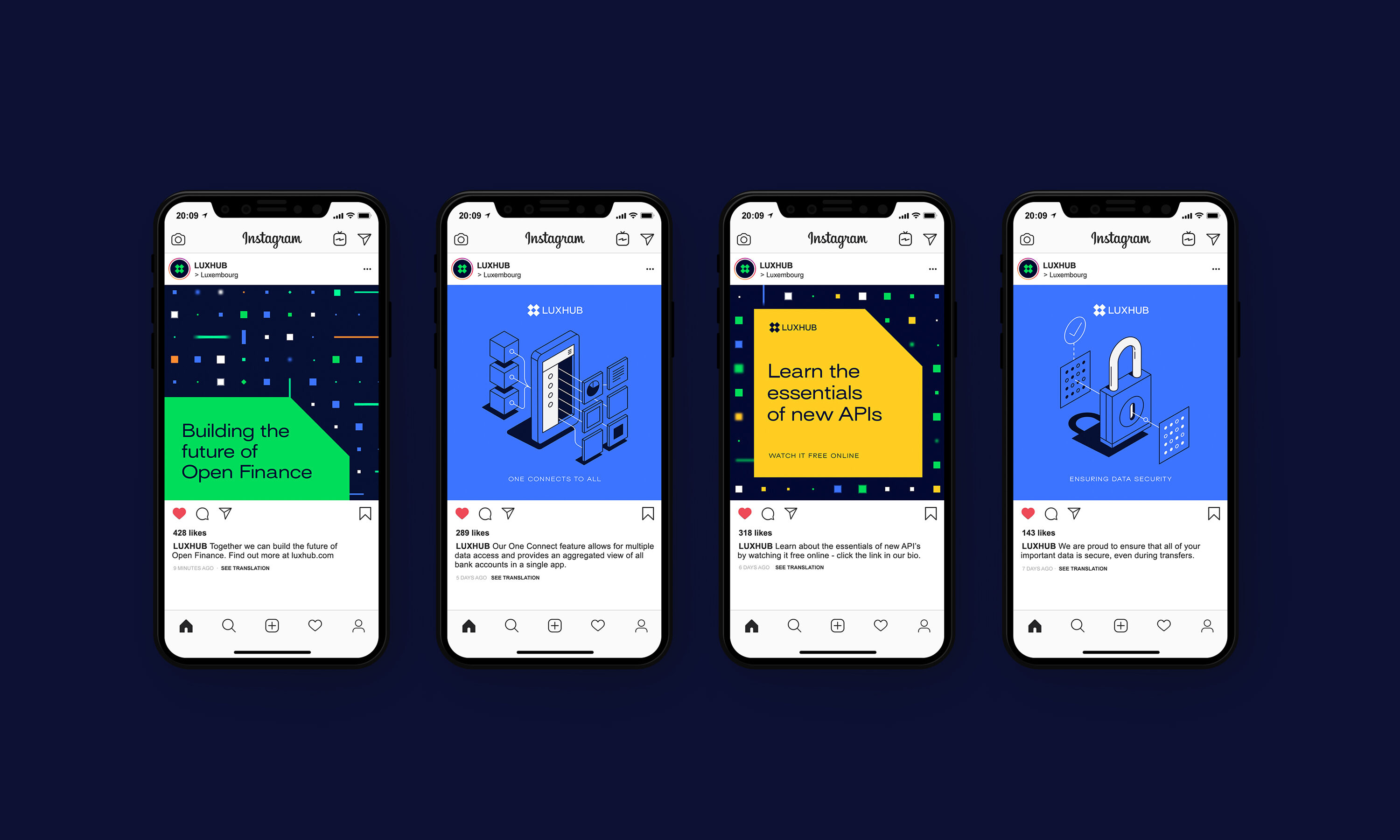
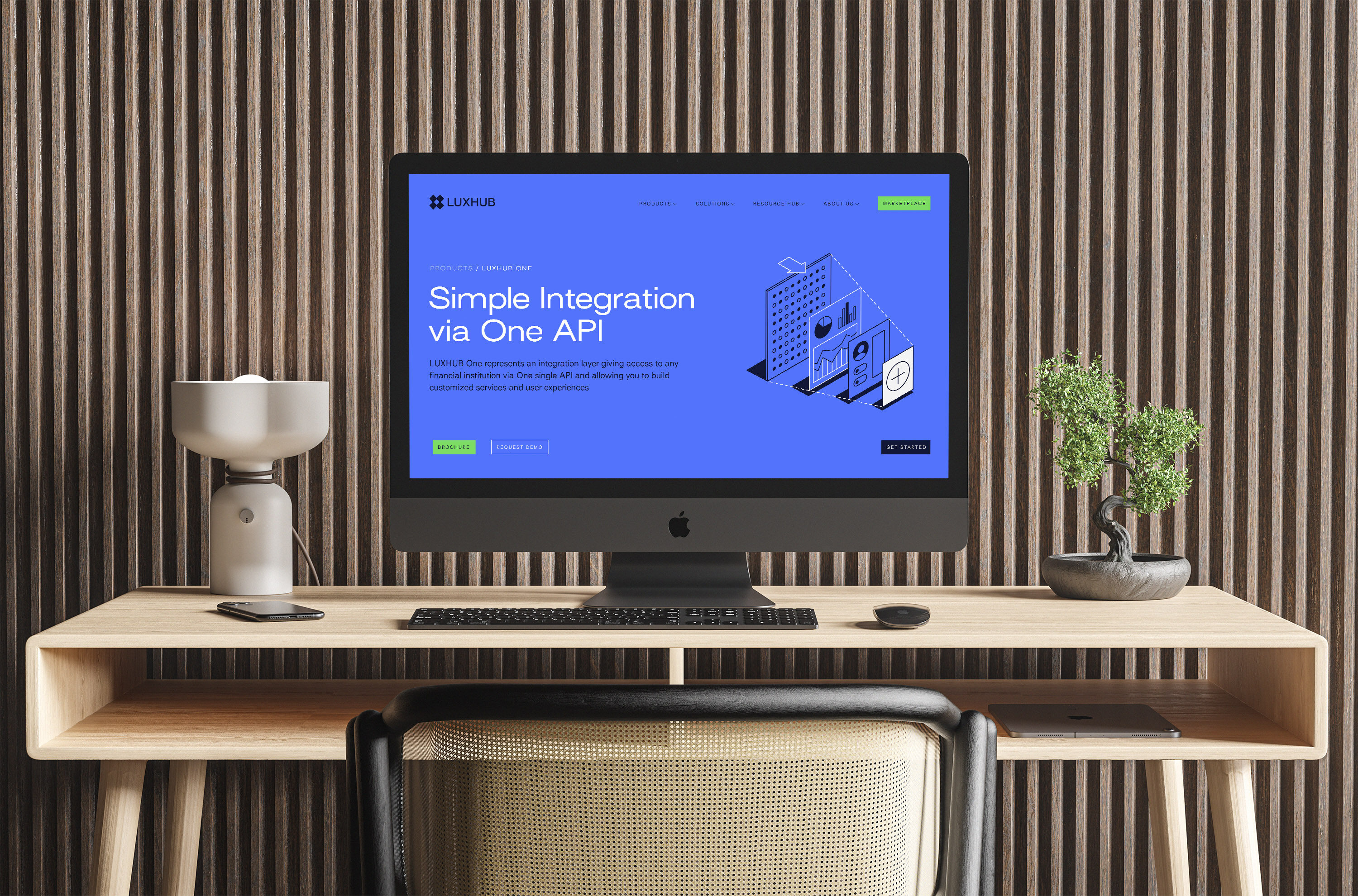
We used illustration to help demystify Luxhub’s financial products and streamline the overall user experience. We developed a series of illustrations with Argentina-based illustrator, Mauco Sosa. These act as mini ‘user guides’ and help usher users through Luxhub’s various SaaS products.
Rebrands are rarely straight forward, so having such an adaptable, willing, and communicative agency on board is crucial. The response – both internally and externally – has been great and we now feel far more ready to tackle the next chapter of our growth as a company.
Matthew Sarson, Marketing Manager, Luxhub
Product-led brand for fintech designed to bring clarity and money confidence to the Portuguese market
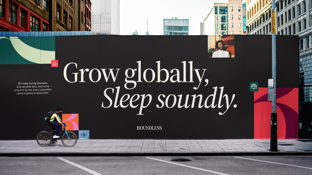
A new digital-first identity for global hiring SaaS platform that offers peace of mind employment