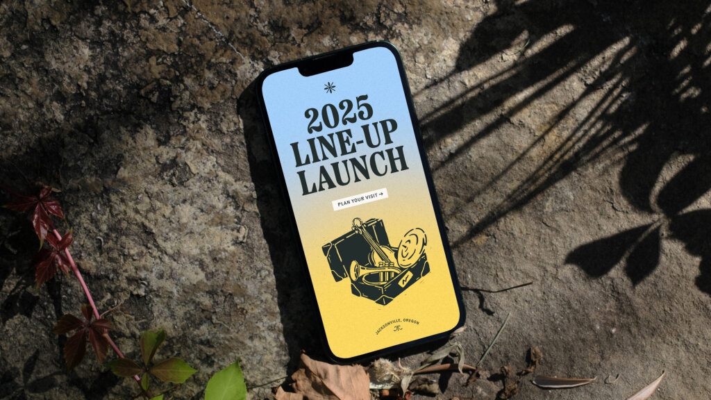
Britt Music & Arts Festival
An identity and digital experience that captures the emotional energy of performance, place, and community
It’s not what we make, but what we make possible.
Explore the work driving real connection and tangible growth.

An identity and digital experience that captures the emotional energy of performance, place, and community

Powering up the brand experience for pioneers of zero-emissions flight

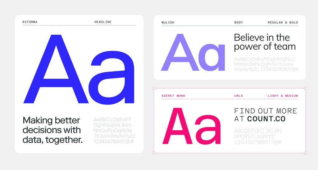
A confident brand refresh for SaaS tech start-up that adds a human touch

Launching a new brand and website for world-first biotech start-up set to transform the future of food

Driving momentum with a bold identity for next-gen fintech start-up
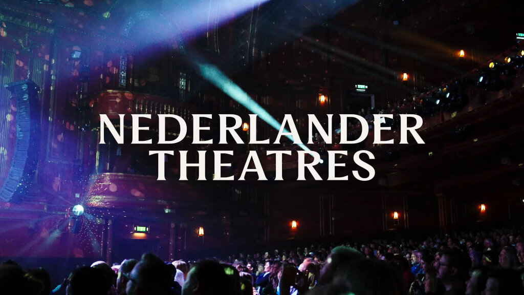
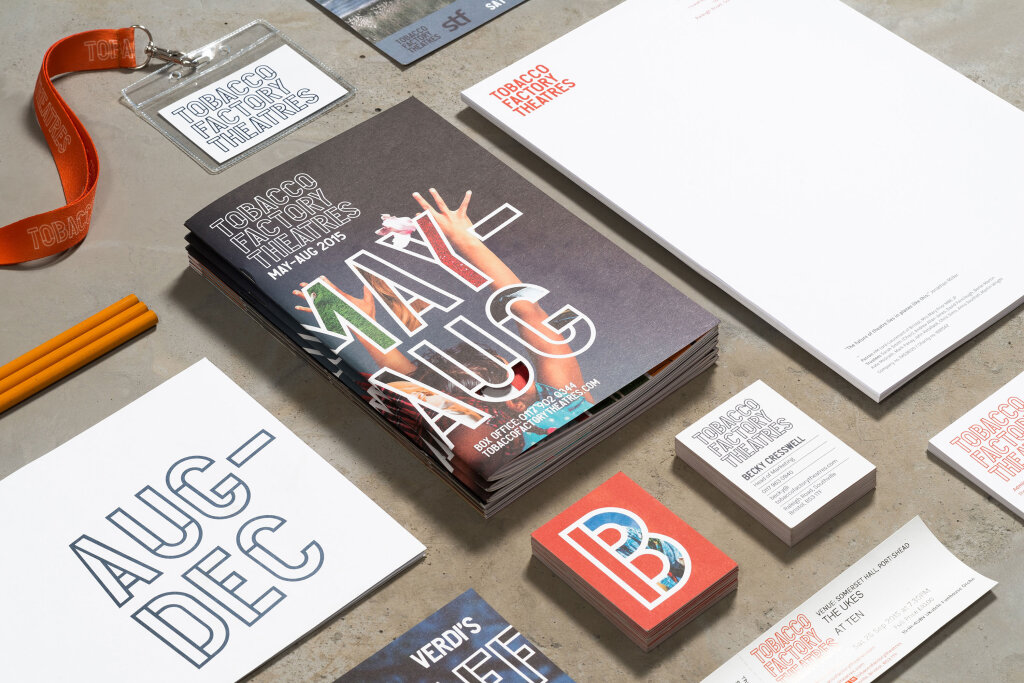
Elevating a century-old theatre group with a brand built to take centre stage

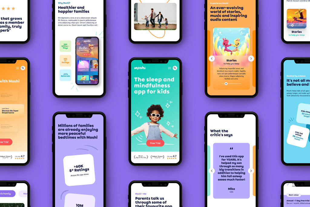
Championing emotional wellbeing for the next generation, one child at a time
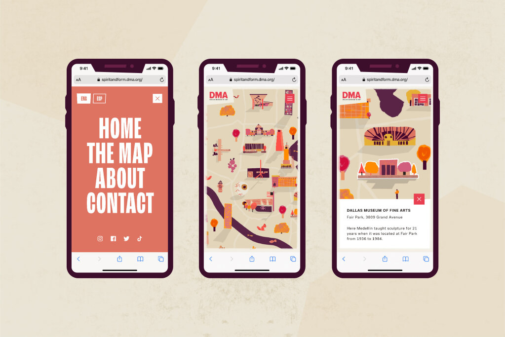
Mapping out the life’s work of artist, Octavio Medellin

Concept strategy and creative direction for the Rugby League World Cup 2021

Flavour-filled brand identity for plant-based food start-up, that feeds your curiosity
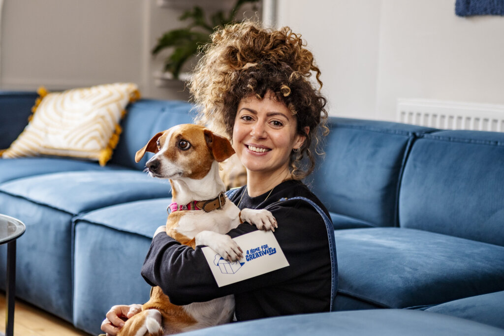
Shaping a brand identity and website for Gather Round – a vibrant community of creative professionals

Trailblazing brand and website for an online media company with boundless ambition
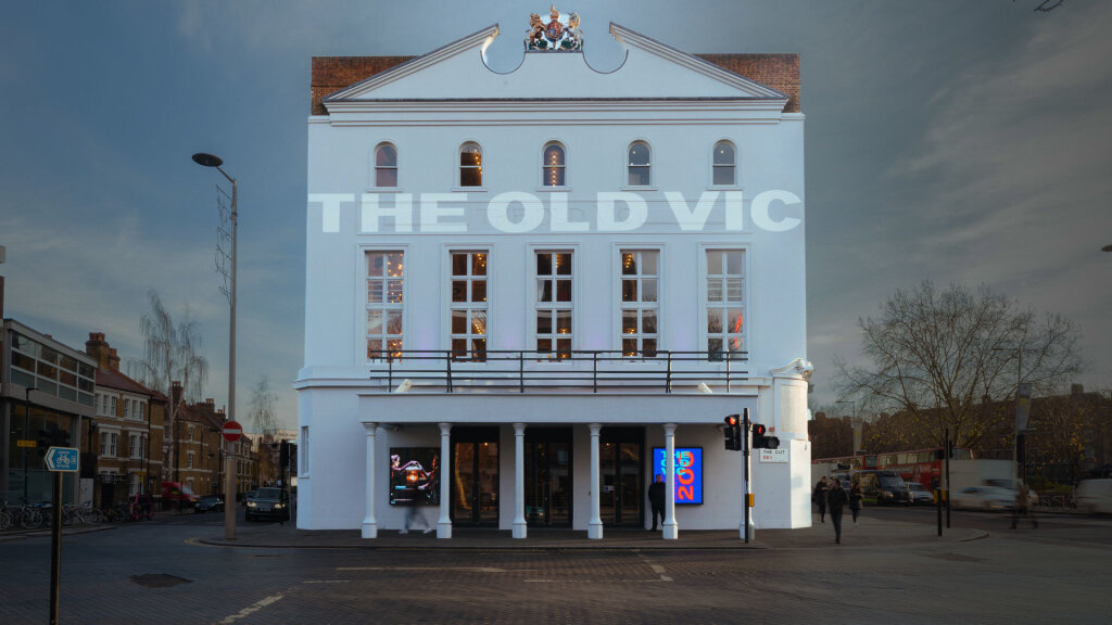
An interactive educational microsite for The Old Vic Theatre, that aims to make the world of theatre more accessible.
A new brand for award-winning coding academy with inclusivity at its heart
A radical rebrand for a college dedicated to the arts
