
Daya
Product-led brand for fintech designed to bring clarity and money confidence to the Portuguese market
From the studio
Fiasco team titbits, delivered fresh to your inbox every Friday at 4pm. Want in? Drop your email below, and we’ll see you Friday.
Aperol and Prosecco Peach Fizz by Booths
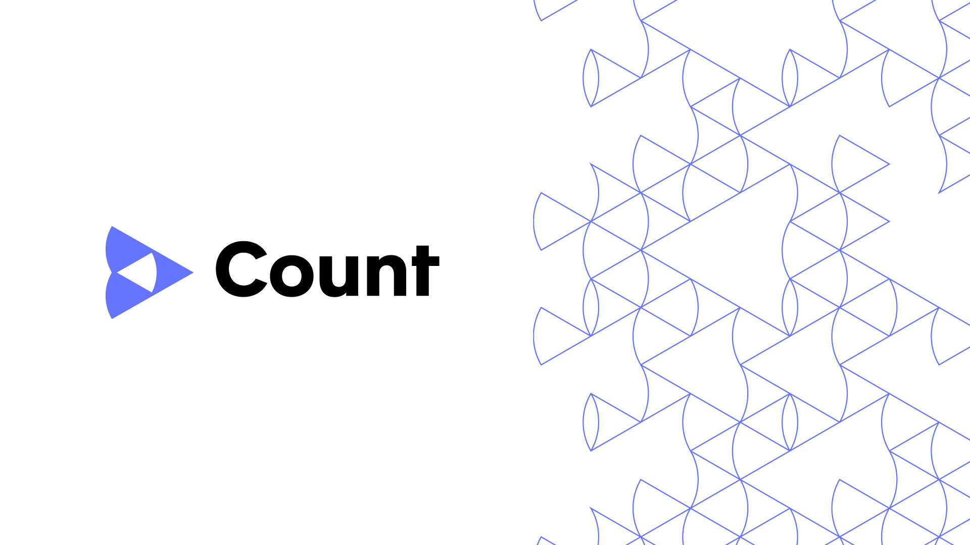
Count is a collaborative data platform that helps to bring data into decision-making.
When we first met the team at Count, their product was a SQL notebook; a simple, smart tool for data analysts to share data. However, their ambition was to push the product further; to create a tool that could be used across different product teams, helping to democratise data.
The new Count tool is accessible to even the most data-phobic team member. A truly collaborative platform that helps businesses move forward by weaving data into the larger business narrative.
Too often data platforms are branded for a technically-minded (often male) audience. Count wanted to turn this on its head. Our challenge therefore was to help reposition the brand by creating a visual identity that would open up the complex world of data analysis.
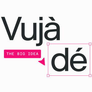
Following initial discussions with the Count team and their vision, we landed on a big idea – Vujà dé.
The opposite of Déjà vu, it’s the concept of seeing something familiar but in a completely new light. It invokes that sense of understanding or “aha” moment, in which data insight can totally change the perspective on a problem or situation.
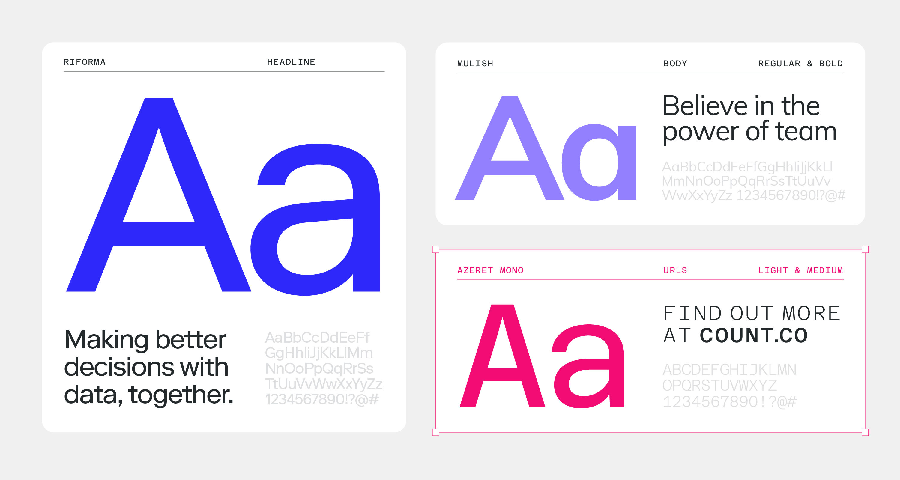
Inspired by data visualisation, we designed a suite of shapes for the brand that morph, evolve and combine to represent the idea of changing perspectives, helping teams to see data differently.
Along with a vibrant colour palette and strong typographic system, the identity challenges category conventions through a more open and accessible design language.
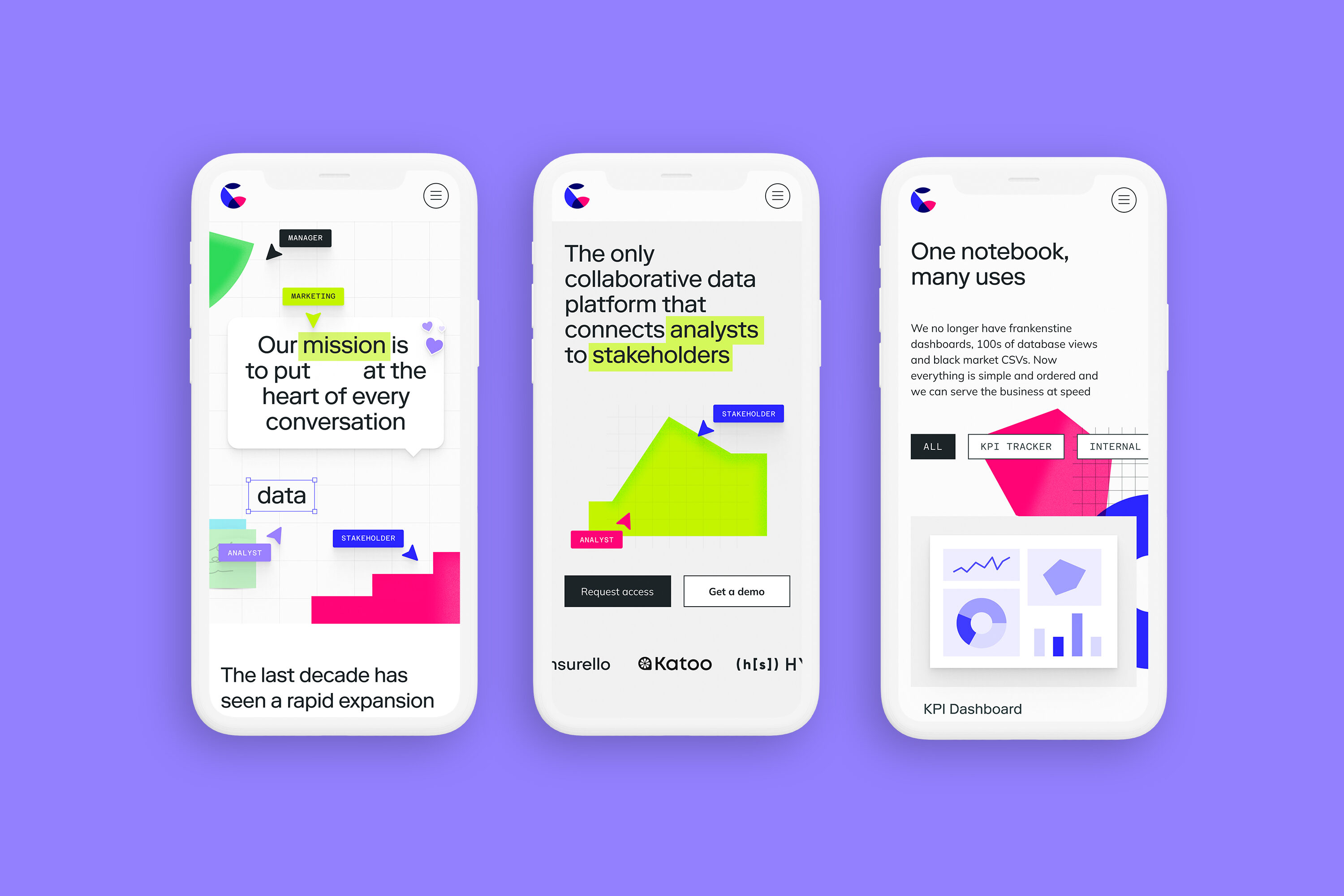
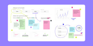
In order to create a seamless customer experience, the updated branding needed to feed directly into the design of the product.
We worked closely with the in-house development team at Count to produce a set of styles and elements that neatly tie the brand into the product.
The Fiasco team were fantastic to work with. We gave them a tough brief and we couldn't be happier with how it turned out. They worked with us side-by-side through the brand process and then helped us deliver vision in digital form.
Ollie Hughes, CEO, Count
Product-led brand for fintech designed to bring clarity and money confidence to the Portuguese market
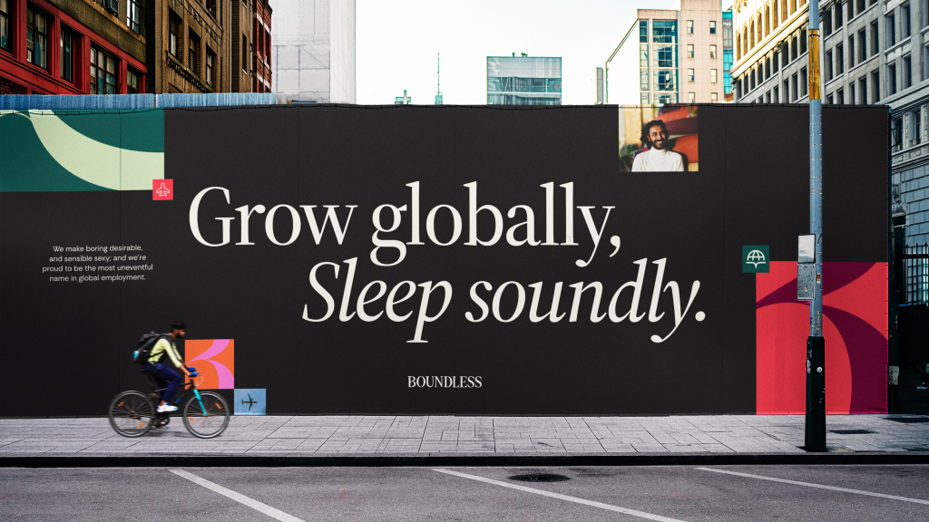
A new digital-first identity for global hiring SaaS platform that offers peace of mind employment