Daya
Product-led brand for fintech designed to bring clarity and money confidence to the Portuguese market
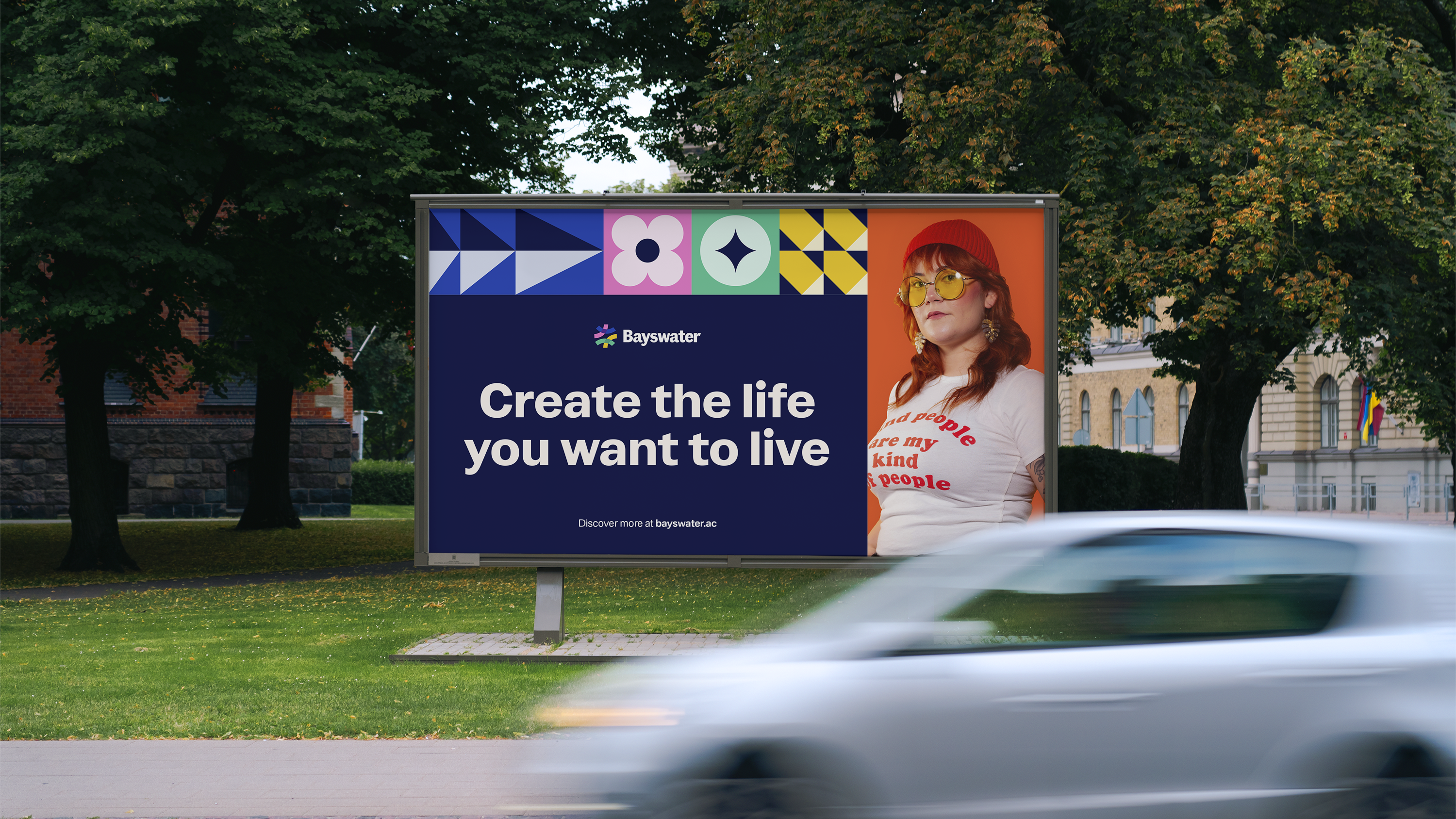
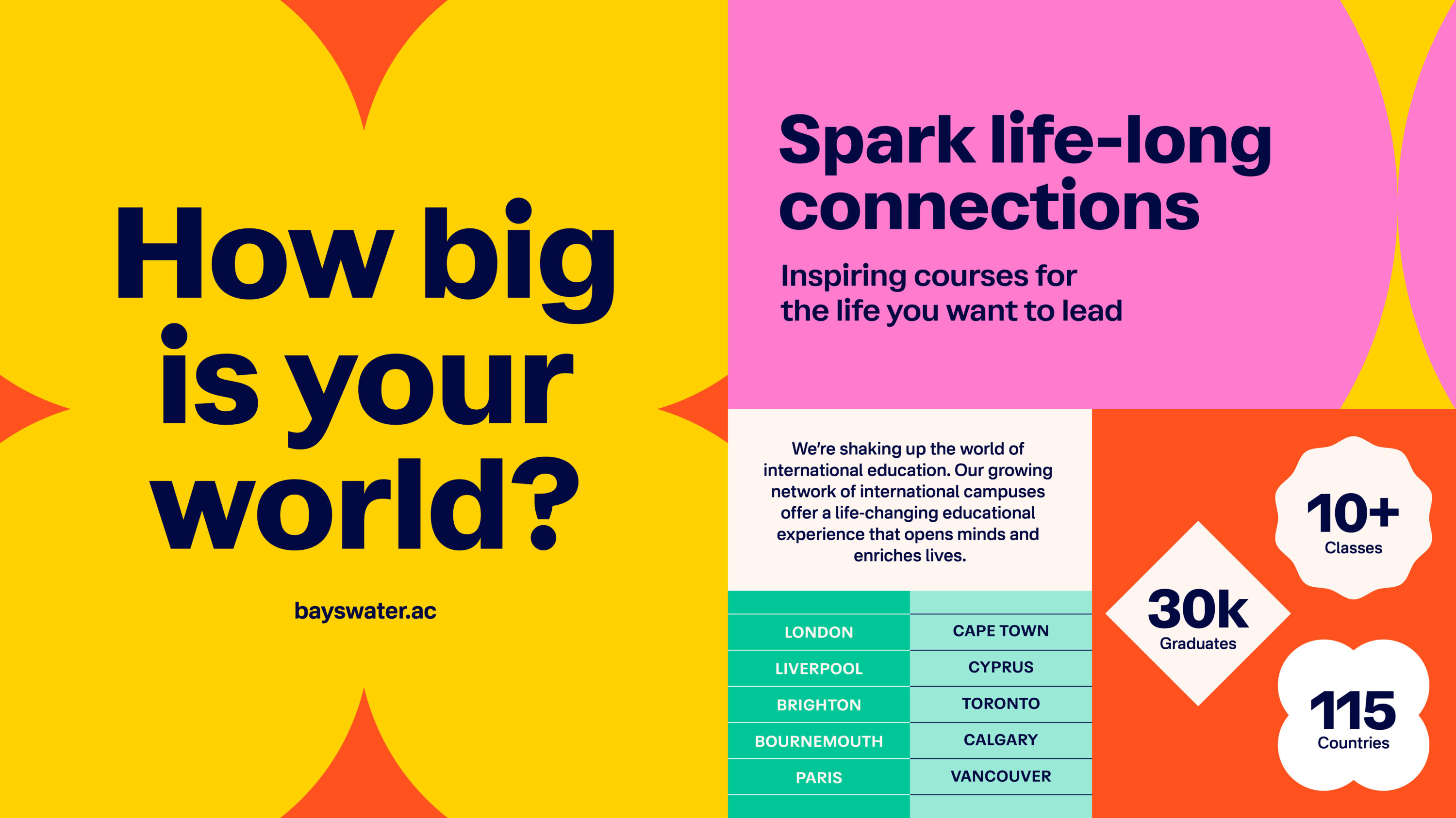
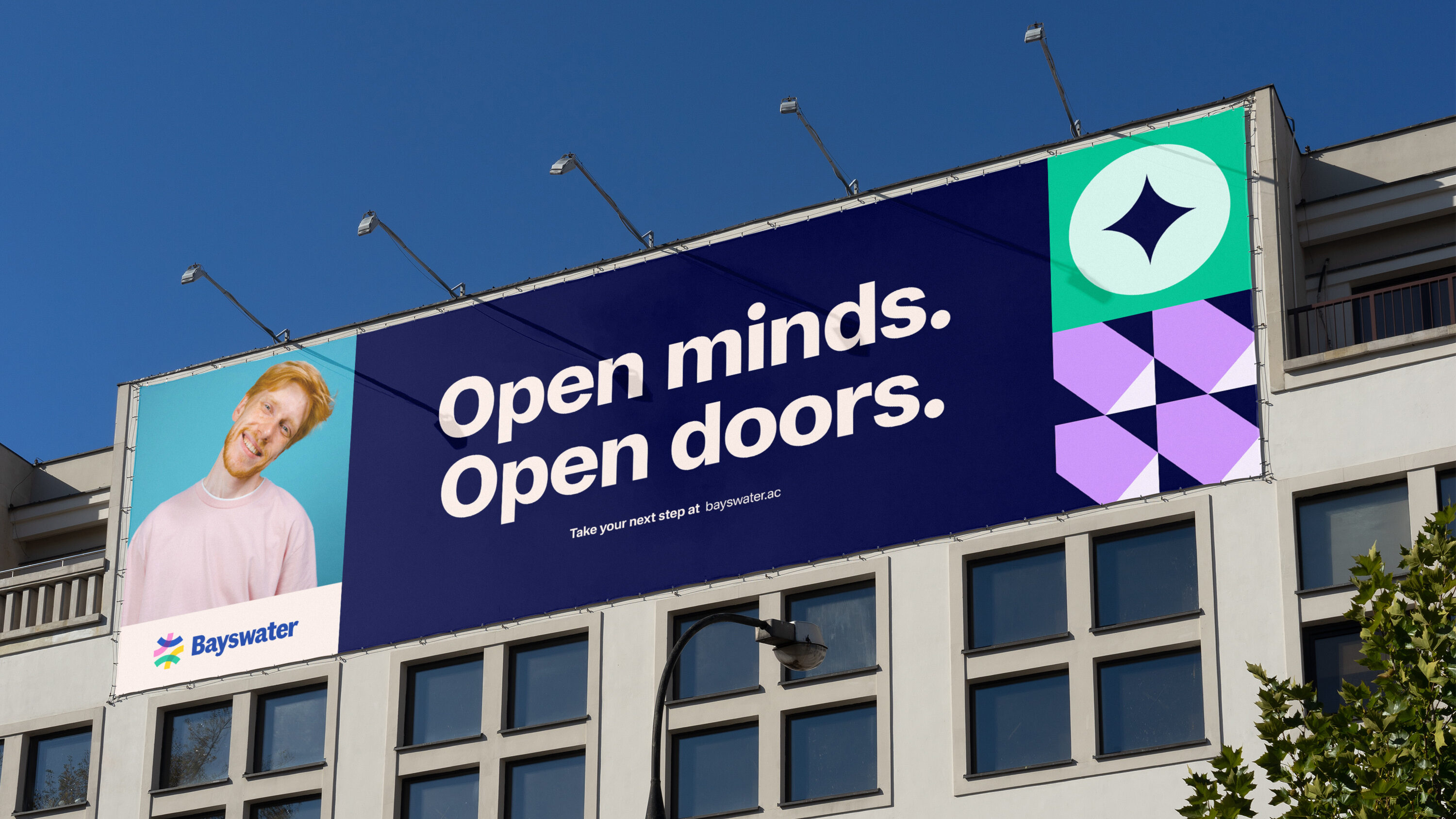
Bayswater is shaking up the world of international education. Combining two of life’s greatest adventures: education and travel, their rich and vibrant experience goes above and beyond the standard offer.
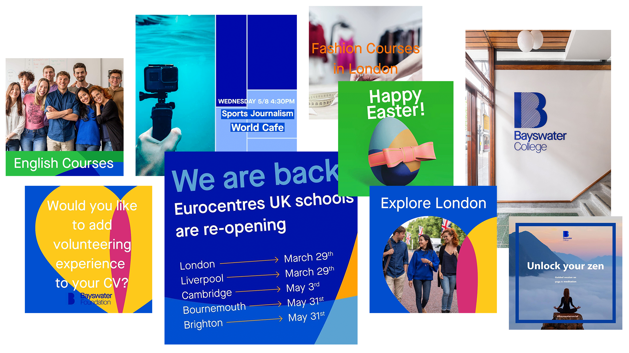
Founded in 1973, Bayswater’s doors are open to global and local young audiences alike, offering them the chance to explore their future career through relevant vocational skills, whilst building vital life experience.
We worked closely with the team at Bayswater to create a bold new visual and verbal brand; unifying their distributed campuses; and better representing their spirited ethos and diverse community of students.

Learning at Bayswater extends beyond the classroom walls. We took this idea and ran with it. Harnessing the spirit of adventure, the brand celebrates the big wide world and all its endless opportunities.


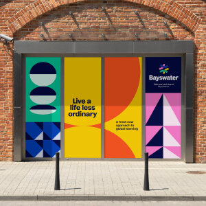
Setting Bayswater apart from traditional international education providers, we developed a fast-paced and spirited identity.
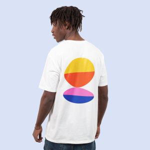
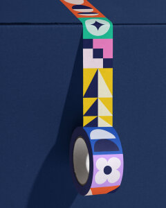
We designed a dynamic and bold suite of patterns, representative of Bayswater’s rich and diverse community, constantly evolving and moving forwards. Whilst the brand palette and typographic system was developed to capture the aspirational and energetic tone of the brand.
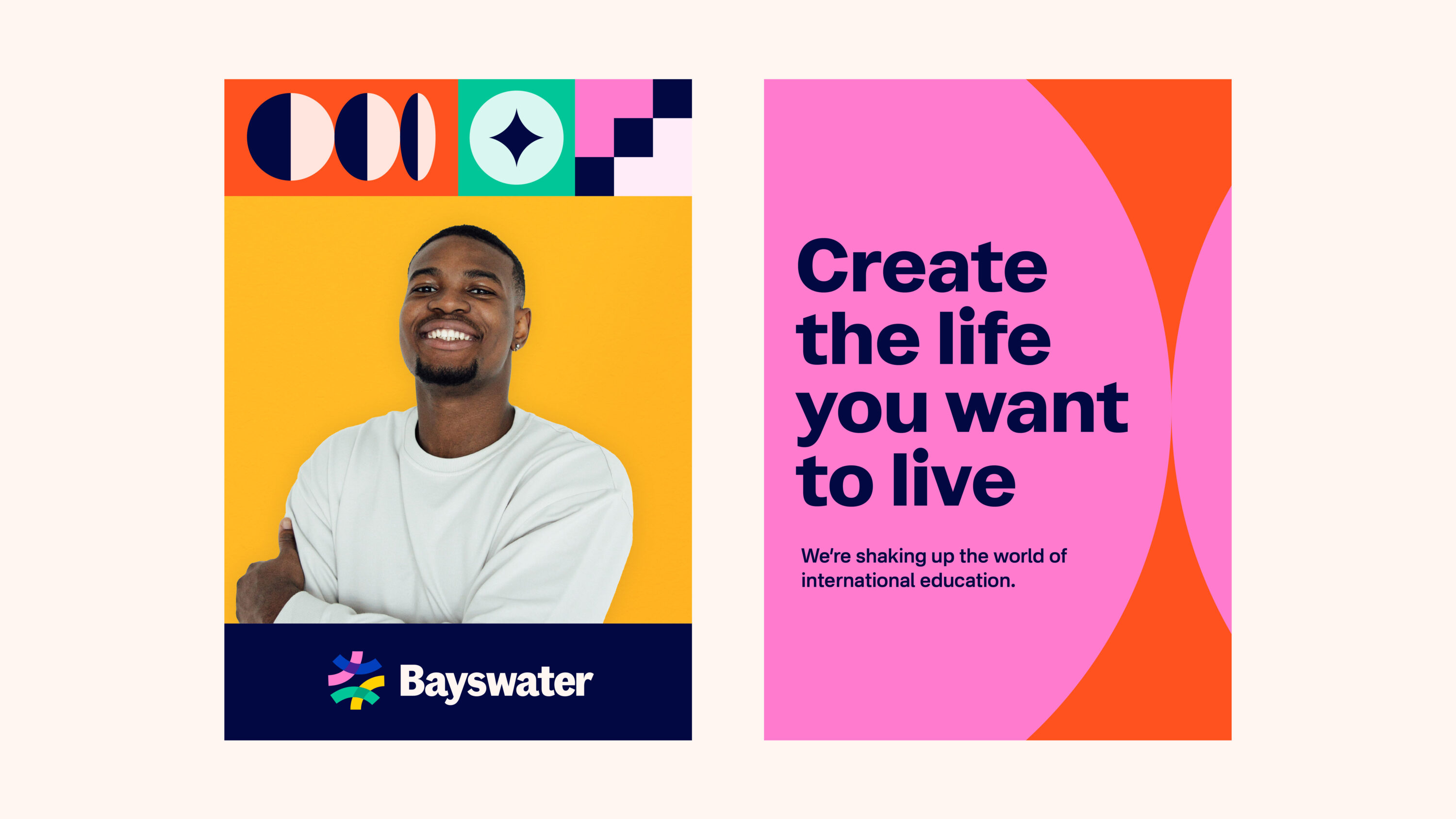
The logo represents the coming together of personal journeys. Coloured pathways represent students of different cultures following their own unique path, uniting as the Bayswater community.
Typeface Fann Grotesque helped to ground the playful visual identity, giving the logotype a characterful, yet trustworthy feel.


Photography is intended to feel active and optimistic. Celebrating individual personalities, it was important that imagery was inclusive of a diverse global community of students.


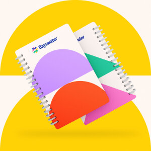
A flexible grid system was created to allow the pattern work and content to flex proportionally across various formats and orientations.


It’s been great working with Fiasco on our full rebrand. It's been highly collaborative and it's very exciting to see the new look come to life across so many different platforms and formats.
Product-led brand for fintech designed to bring clarity and money confidence to the Portuguese market