
Gather Round
Shaping a brand identity and website for Gather Round – a vibrant community of creative professionals
From the studio
Fiasco team titbits, delivered fresh to your inbox every Friday at 4pm. Want in? Drop your email below, and we’ll see you Friday.
Aperol and Prosecco Peach Fizz by Booths
Set in the pine-covered hills of Jacksonville, Oregon, Britt is more than a music and arts venue. It’s a gathering place, a nature park, a nonprofit, and the beating heart of a close-knit creative community. With a 60-year legacy and a setting unlike any other, Britt offers an experience that feels both intimate and extraordinary — a show shared with “2,000 friends you just met.”
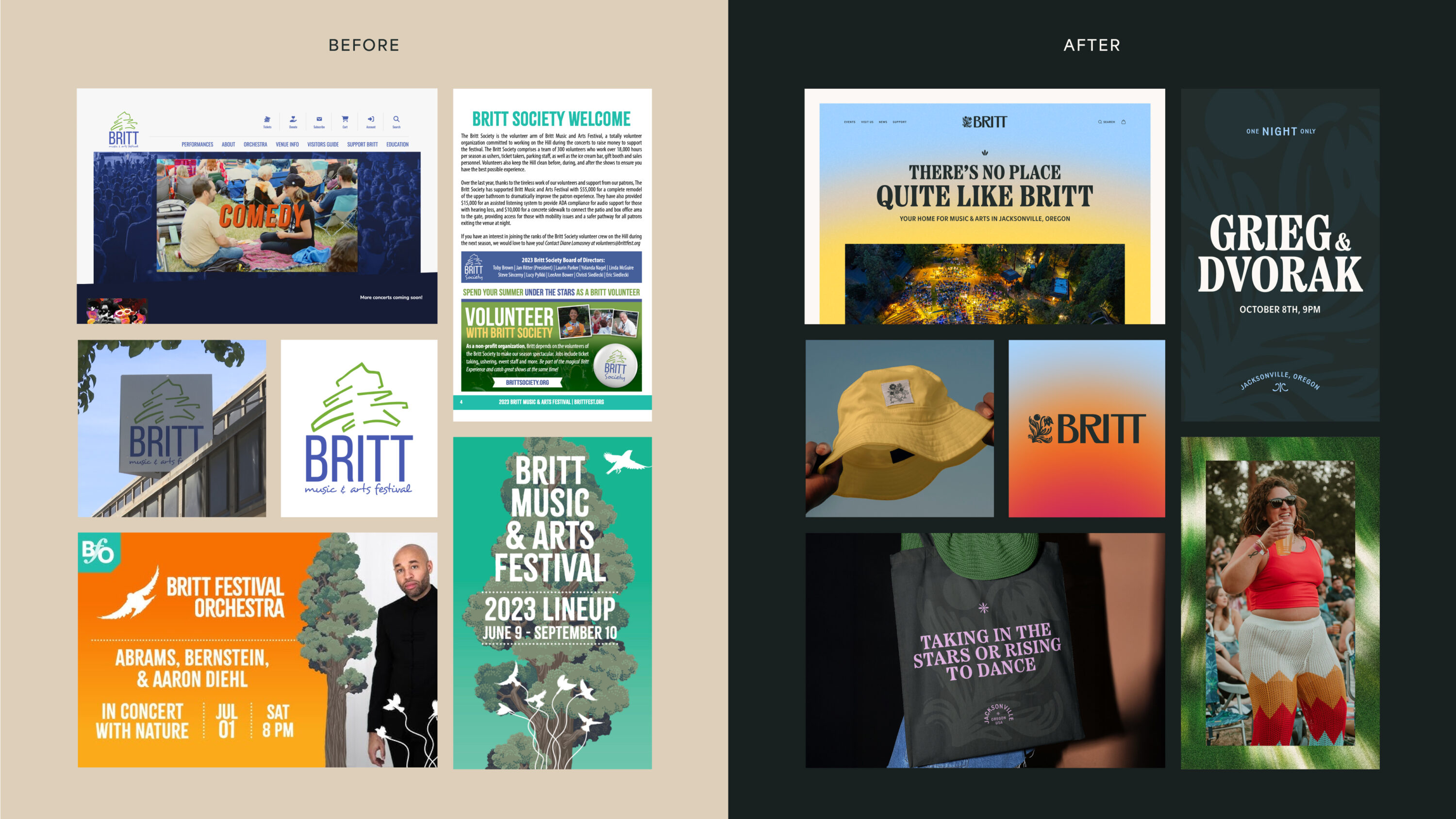
Despite Britt’s unique character and local significance, it’s relatively unknown outside of the Pacific Northwest. Created piecemeal over decades, the brand lacked depth and cohesion.
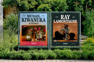
With goals of increasing national appeal, boosting memberships, and attracting bigger artists, we were brought in to unify the brand — from brand strategy and naming, to visual identity and digital experience, our job was to reframe Britt as the extraordinary experience it already was.

To truly understand Britt, the Fiasco team headed to the Pacific Northwest to immerse themselves in the landscape, culture, and character of the place.
What emerged was the core challenge: not just to design a brand, but to bottle a feeling – the magic of a night under the stars, surrounded by 2,000 strangers who suddenly feel like friends.
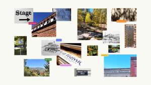
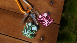
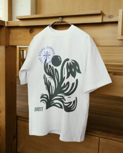
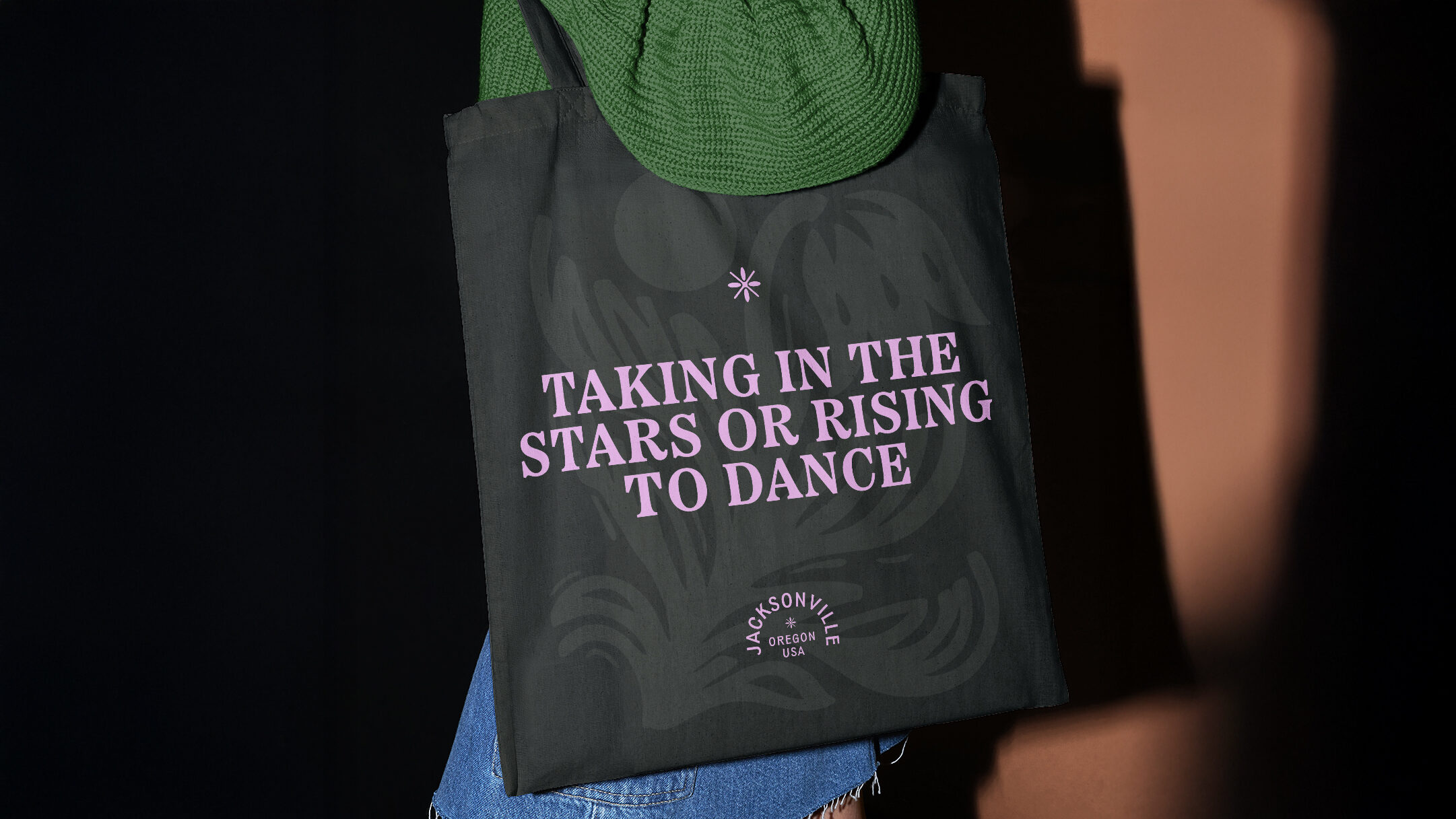
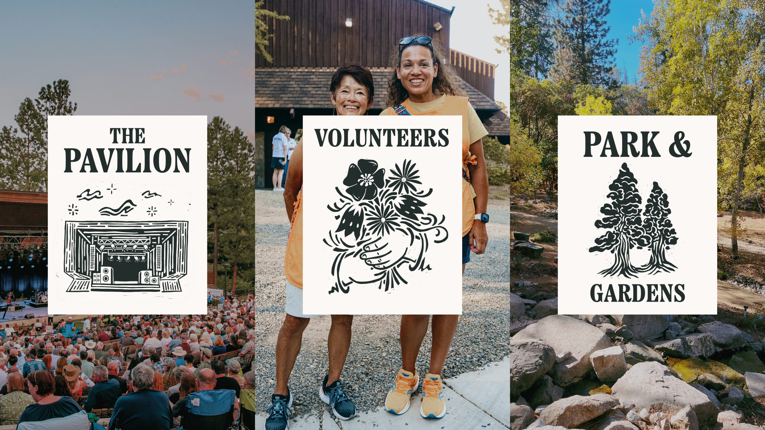
At the heart of the new identity is a clear sense of place. Nestled in a natural amphitheatre among Oregon’s ponderosa pines, Britt’s unique environment is part of what makes it special. This relationship to the land formed the basis of a logo system inspired by native flora and a tradition of woodblock printing.

Inspired by Jacksonville’s rich visual heritage – from weatherworn signage to archival prints – we selected a typeface that nods to the past while feeling fresh and accessible. Etna Condensed Extra Bold, with its tall woodblock style and characterful flicks, nods to the past while feeling fresh, accessible, and distinct.
The colour palette reflects Britt’s broad offering – from orchestral calm to festival vibrancy. Muted neutrals ground the system, while saturated accents and emotionally-driven gradients bring energy, warmth, and depth across every touchpoint.
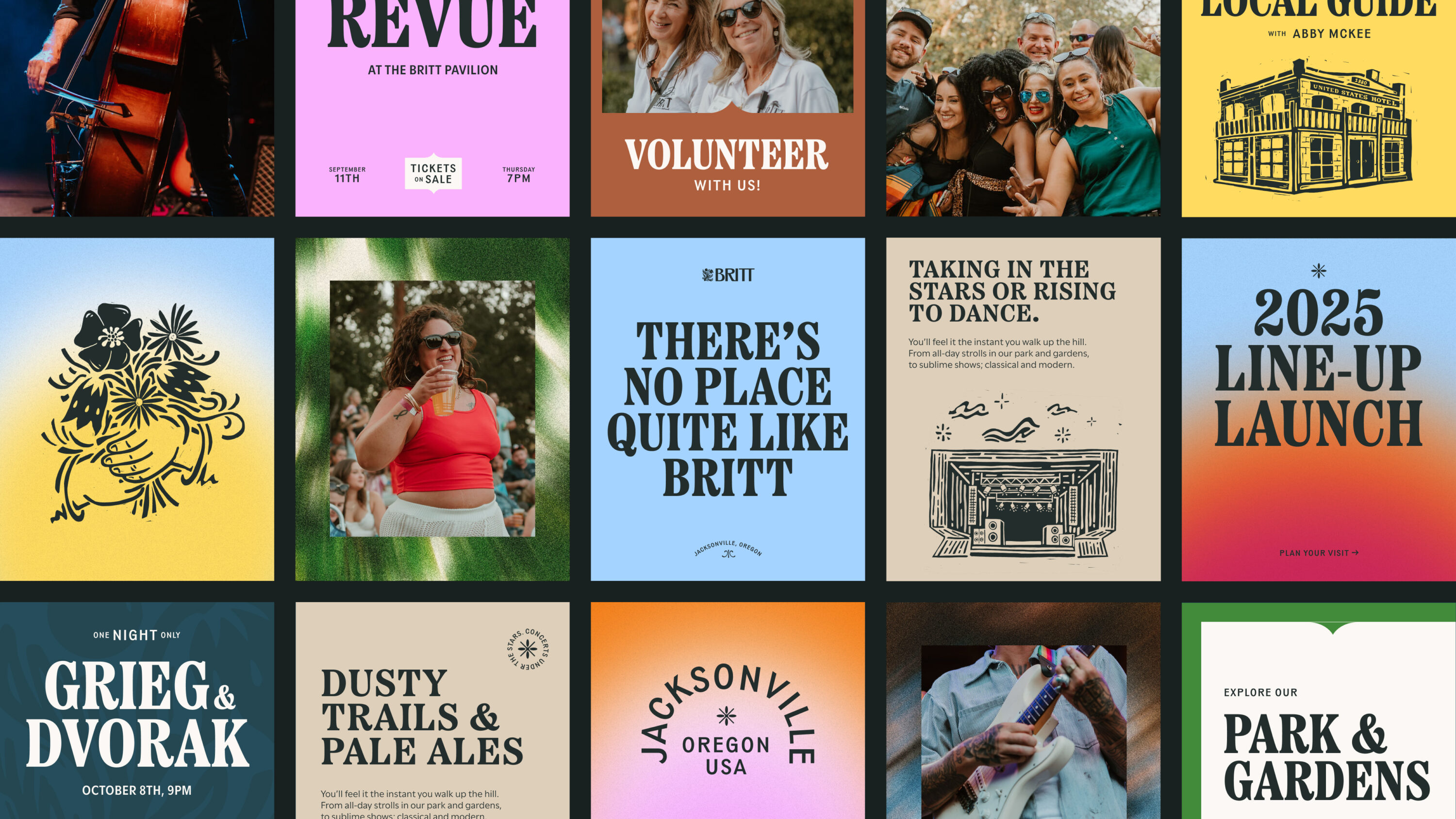


We developed a visual approach to photography that leans into the sensory experience of Britt – a place where light shifts, music moves, and time slows. A directional blur, grain, and atmospheric overlays hint at the swaying of bodies, golden-hour haze, and fleeting moments that linger in the mind.
These textures extend into illustration, with a library of hand-drawn elements inspired by local architecture, signage and craft. Layered into the identity, these weave in the town’s character in every little detail.
Listen to Chris Tozer, Creative Director, discuss how we recreated the feeling of being at Britt.
Harnessing the lived experience
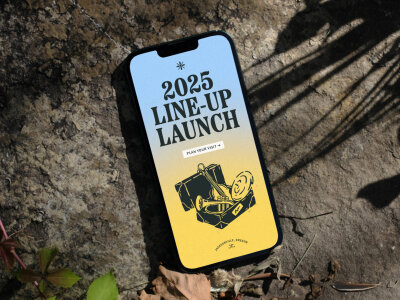
Designed to reflect the intimacy and atmosphere of the live experience, the new website supports ticketing, artist discovery, membership growth, and storytelling in one cohesive platform.
From the first scroll to final click, the site captures the warmth and spirit of the hill – translating Britt’s unique sense of place into a digital space that feels inviting, intuitive, and full of life.
Working with Fiasco was a transformative experience. They took the time to truly understand who we are at our core and delivered a visual identity that’s nuanced, clever, and deeply thoughtful. While honoring our legacy and deep-rooted connection to Jacksonville, the new brand captures the heart of Britt and gives us a flexible, forward-looking foundation we’re proud to carry into the future.
Fran Jamison, Director of Marketing and Communications, Britt
Shaping a brand identity and website for Gather Round – a vibrant community of creative professionals
Elevating a century-old theatre group with a brand built to take centre stage