
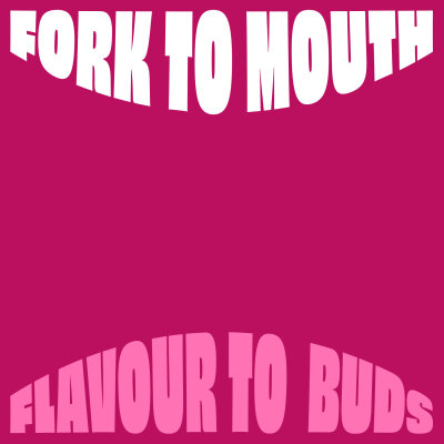
Eat Curious
Flavour-filled brand identity for plant-based food start-up, that feeds your curiosity
Eat Curious is on a mission to help everyone discover new ways to eat healthy and delicious plant-based food, without taxing the planet. They put curiosity at the heart of everything they do. So much so, they’ve built their own vertical farm – a near-off-grid, plant playground built to research how to add even more flavour, nutrition and sustainability to the way we all eat.
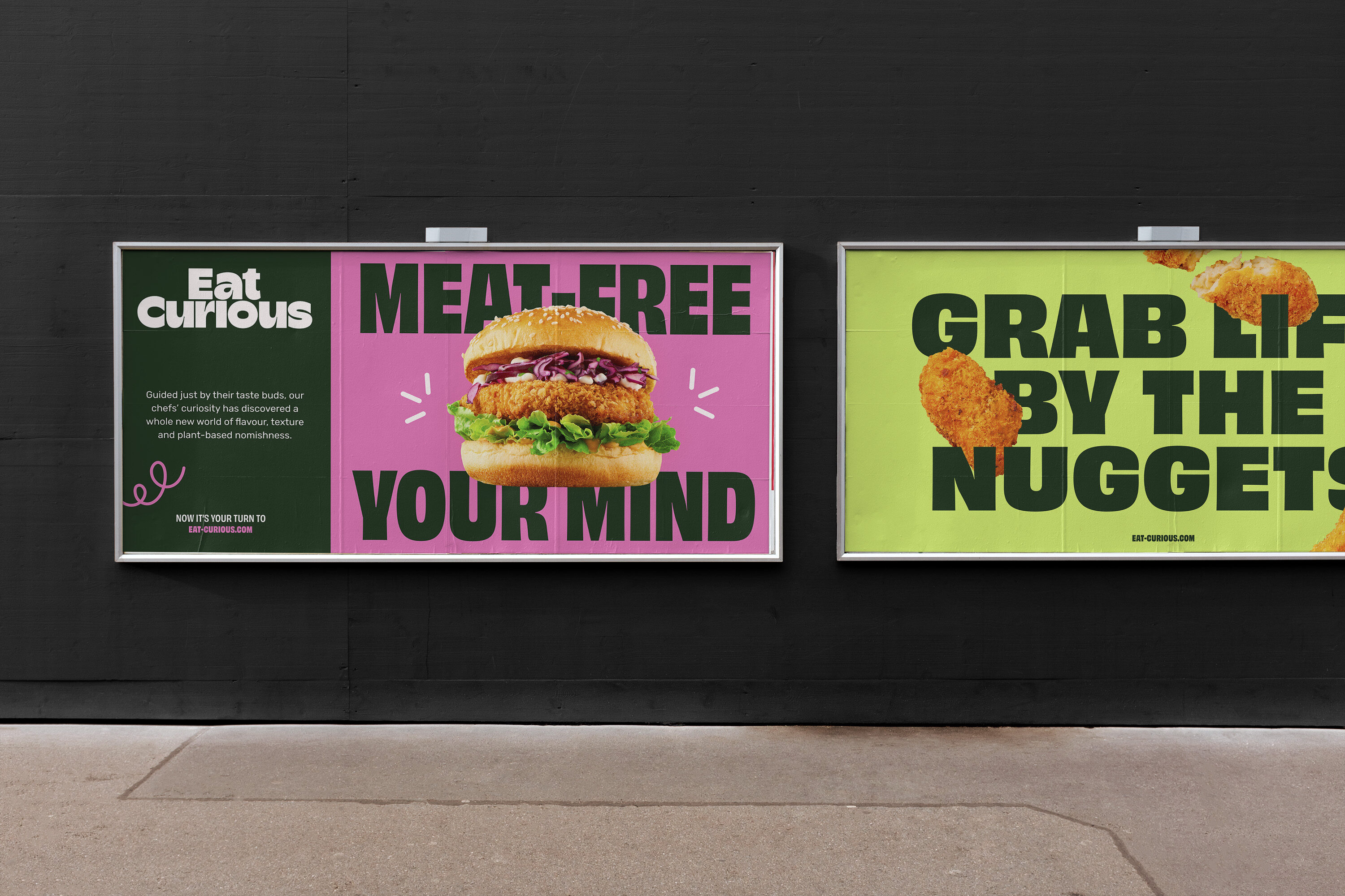
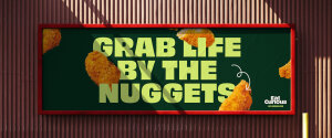
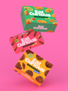
As a new player in a growing market, our challenge was to create a B2B brand – ready for consumer rollout in the near future, that stands out in supermarket aisles and confronts the preconception that plant-based food means a compromise on taste.


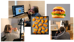
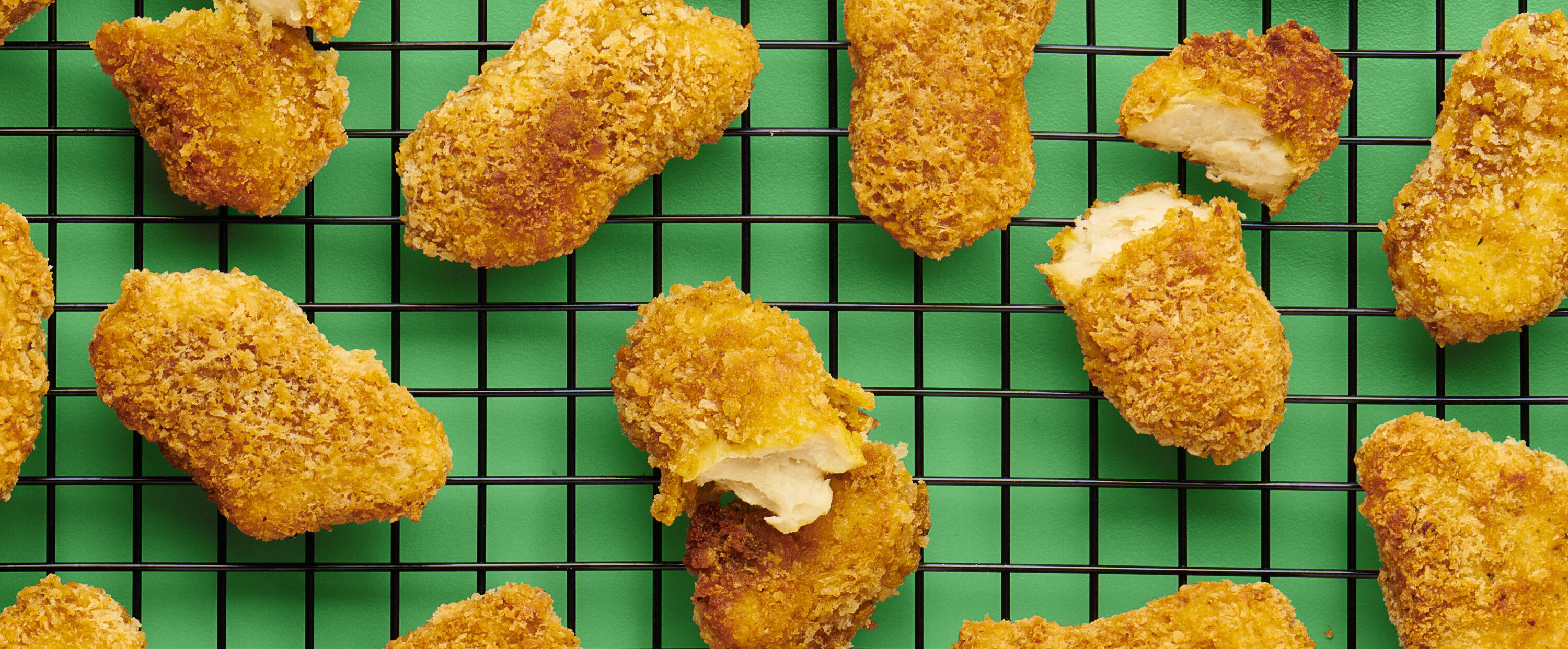
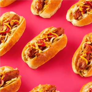
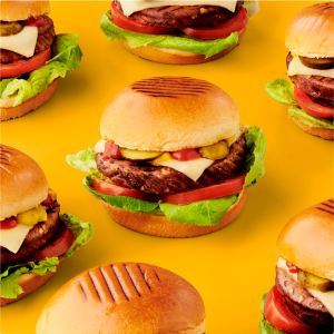
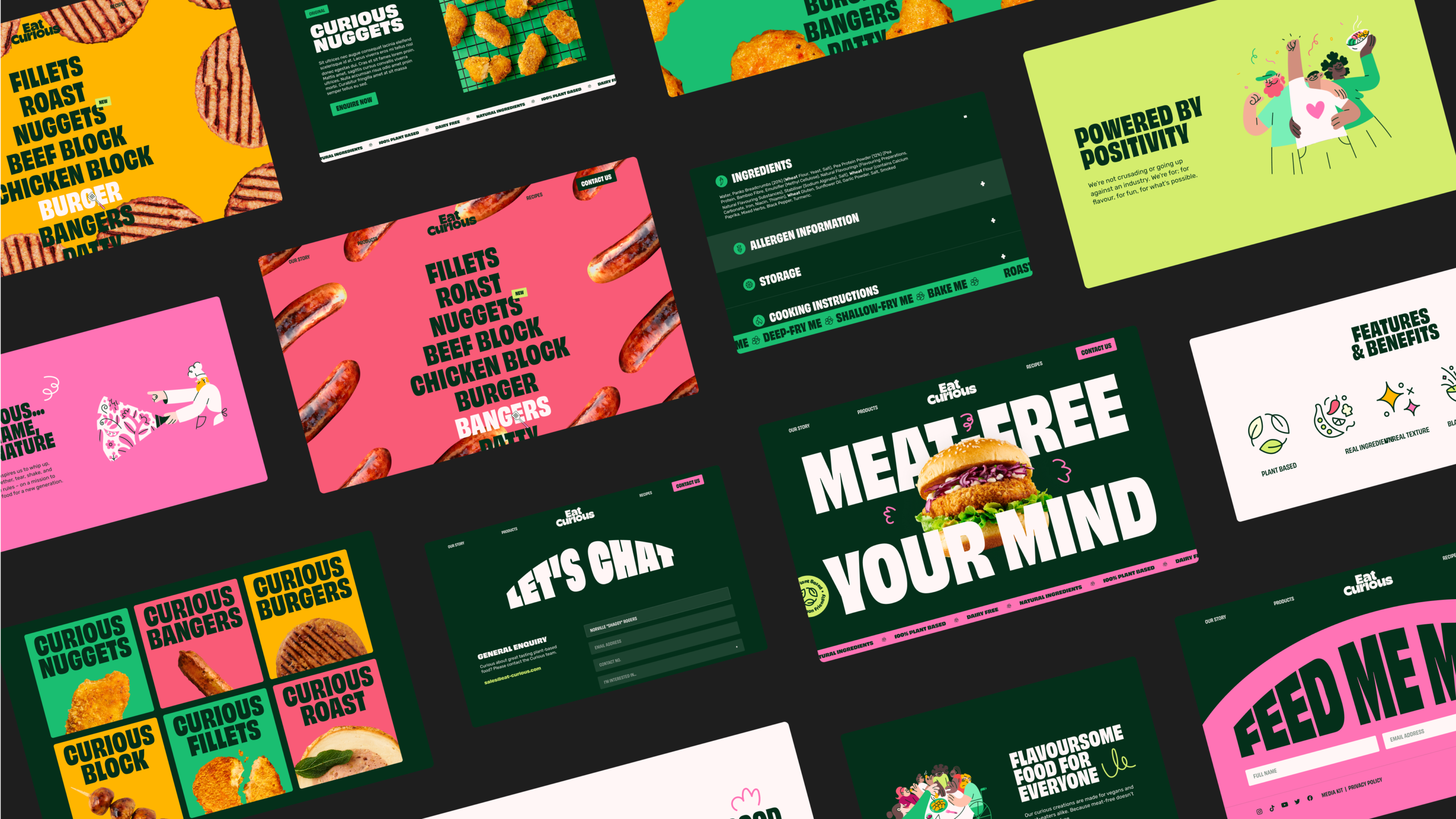
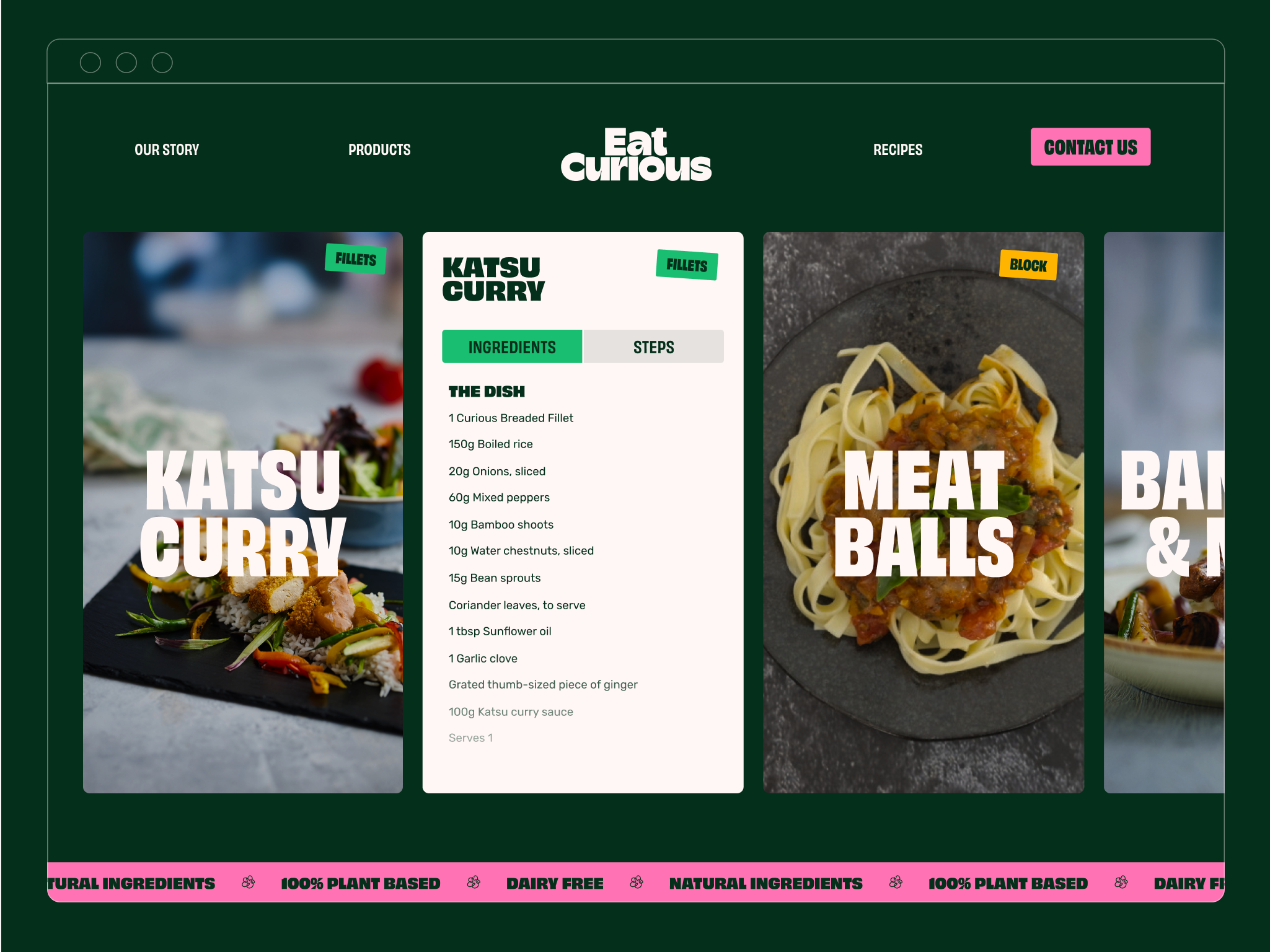
Food photography
Mouth-watering photography heroes the product, showcasing plant-based foods as a delicious choice in their own right. Celebrating look and taste, playful repeating patterns echo the food’s ‘unreal’ texture and add visual intrigue.
Products are shot individually to be utilised on the website for a playful user experience; with cutouts also appearing across social media and packaging. Colour is used to signify the food type and help create ranges of products that sit well together on the shelf.
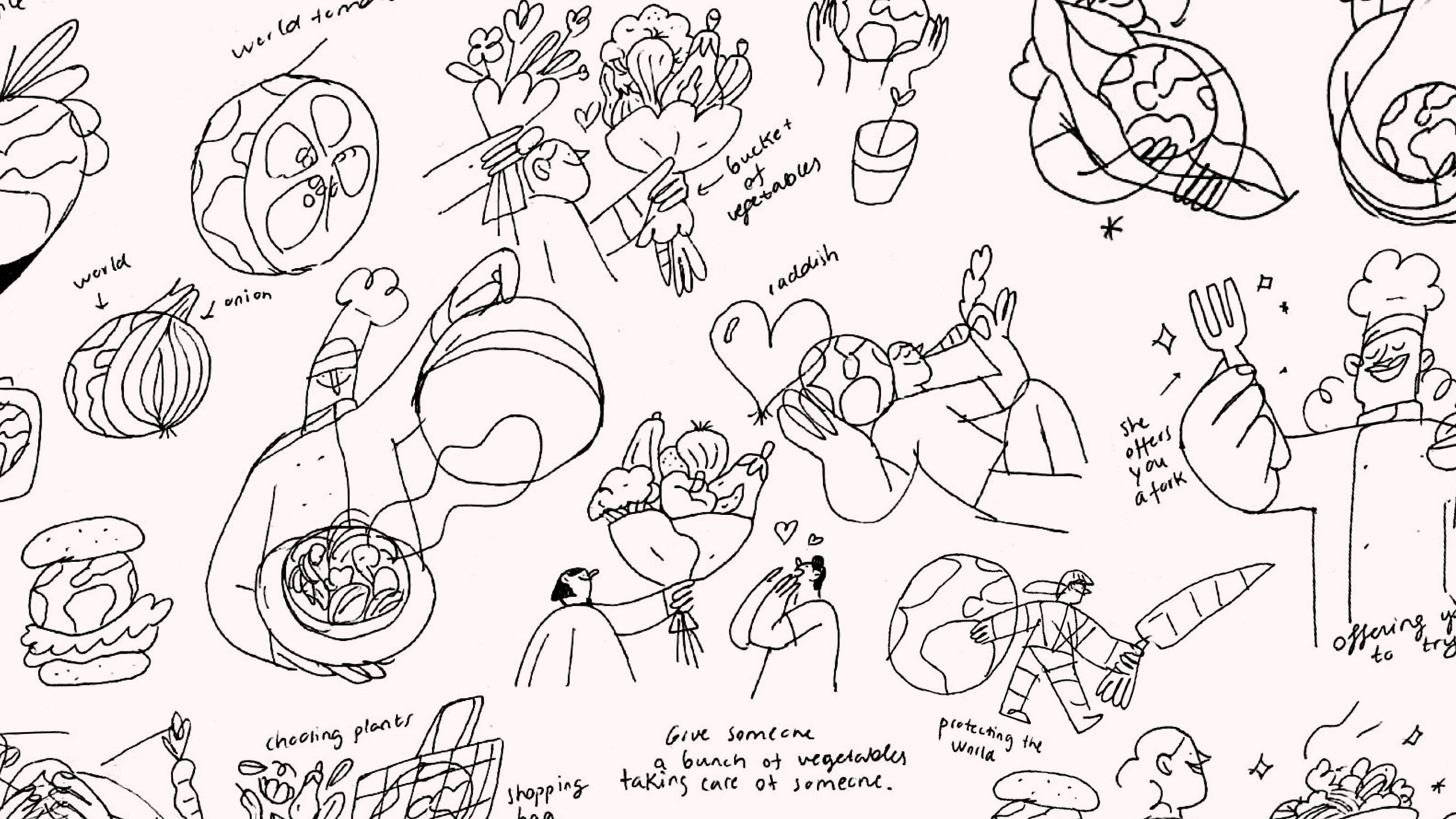
Illustrations good enough to eat
We worked with Madrid-based illustrator, Miguel Angel Camprubi, to push the brand narrative further. A vibrant suite of illustrations reinforce the feel-good nature of the brand and help to visualise the overarching theme of curiosity. Illustrated characters on the site lift the brand off screen and work to position sustainable eating as accessible for all.


A digital home
To bring the brand to life online, we designed and built a digital home for Eat Curious that’s vibrant, bold and playful.
The website was never taught not to play with its food. Curious and unexpected interactions drive the brand narrative, whilst a set of motion principles add extra flex to typography and illustrative elements.
We now have a brand that reflects who we are as a company and what we stand for. The entire Fiasco team were excellent to work with and their level of creativity, attention to detail and commitment to excellence has made all the difference. We are confident that our brand will continue to thrive and grow under their guidance and we are excited to see where our partnership will take us in the future.
Preyesh Patel, Co-Founder, Eat Curious
What's Next?
Innagen
Strategy, naming, visual identity and site for world-first biotech start-up set to transform the future of food