
Vertical
Powering up the brand experience for pioneers of zero-emissions flight


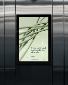
Innagen design and build lab-based technologies that allows food producers to create cultivated proteins, at a scale and pace never seen before. Their pioneering technology mimics the natural growing environment of animal cells. Turning a finite resource into infinite potential and overcoming limitations for both people and planet.
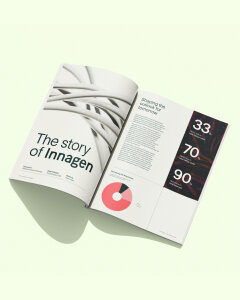
We were brought on board to help them tell their story from the very beginning of their journey, including naming, strategy, visual/verbal/sonic identity, content, web design and build.
Brand idea
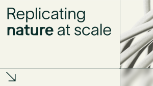
Innagen was founded on the idea that the best way to create cultivated food is to replicate what happens in nature. But doing it in a way that allows for much larger yields.
We translated this core belief into a brand idea of ‘Replicating nature at scale’. A statement that simplifies the complex science but also reminds us of their ethos and expresses their commercial benefit (yield) in a nascent but soon to be competitive sector.
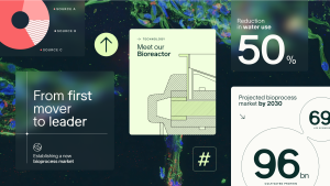
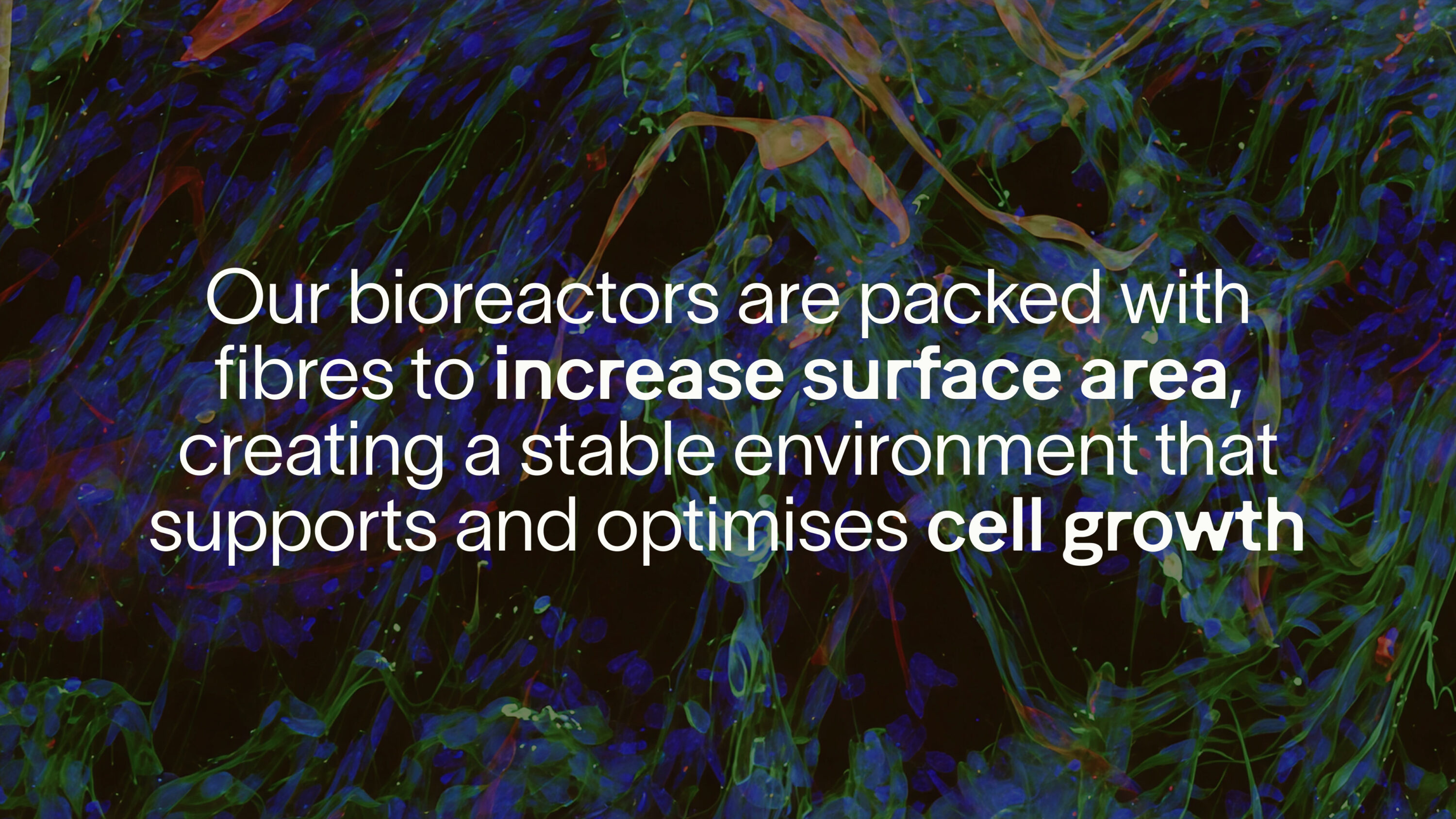
Moving from large stir tanks to smaller environments is what sets Innagen’s technology apart. We designed a key visual to show off what happens inside their modular bioreactors, striking a balance between scientific precision and a modern, premium feel. Grain and depth of field were added to subtly reference the view through a microscope.
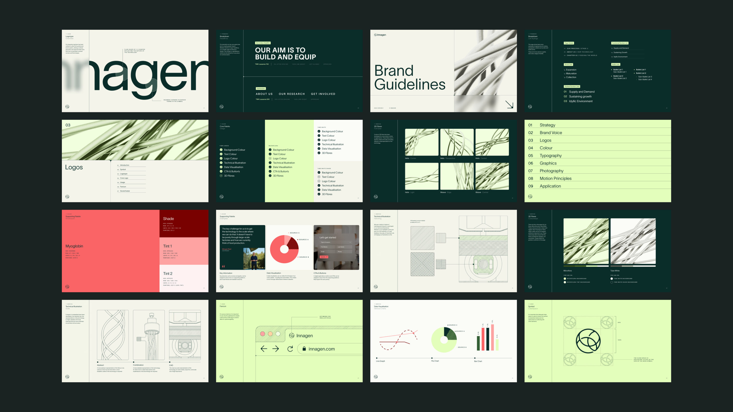
Design system
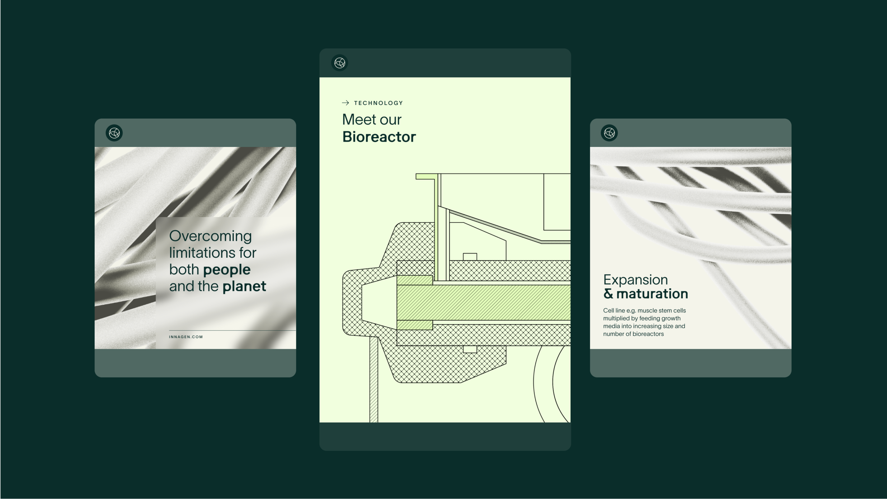
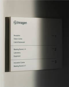
With such a complex technology, our challenge was to simplify it — not just to make it understandable, but to make it visually compelling.
We introduced a graphic device inspired by how cells grow. A subtle rounding of sharp corners helps things to feel more organic and natural, providing a gentle contrast with some of the more technical elements of the brand toolkit, such as the line-based illustrations. The result is a design system that feels alive — grounded in science, but human in tone.
Powering up the brand experience for pioneers of zero-emissions flight
Flavour-filled brand identity for plant-based food start-up, that feeds your curiosity