Change is good. It helps to refocus, to re-energise, to keep moving forward. Change nothing and nothing changes (as someone much smarter once said).

New dogs/bears
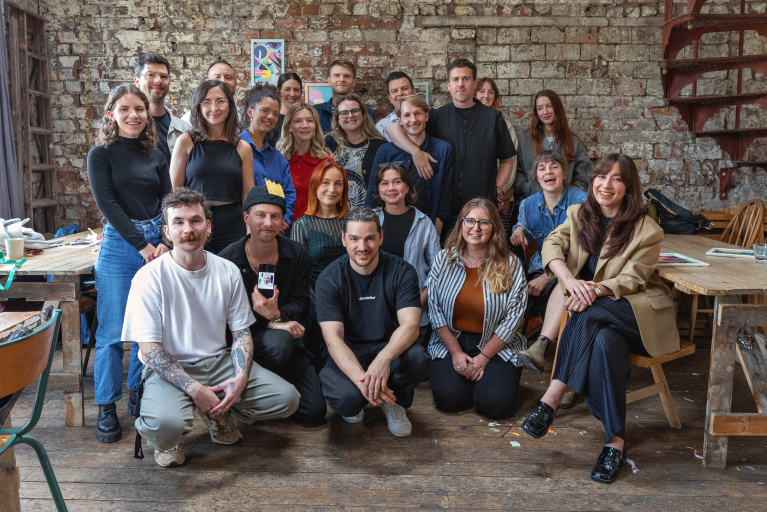
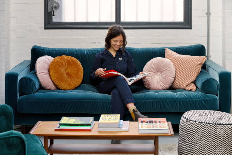
For the past six years or so, the Fiasco Design brand has looked the same. Our branding got stuck in time, minus a few small tweaks and minor alterations along the way. Yet in the studio, we’ve changed immeasurably – new faces, new digs, new clients, new ambitions, new dogs!
We realised it was time for a refresh: to update our branding and website, to better reflect who we are now and where we’re going next.
Our main concern was with a lack of personality. Yeah, the logotype worked just fine and the icon was graphically quite strong, but it didn’t quite feel like us anymore. We wanted to pour more of ourselves and our personality into the branding and find a better way to show who we really are – serious but fun. Seriously fun.

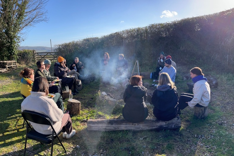
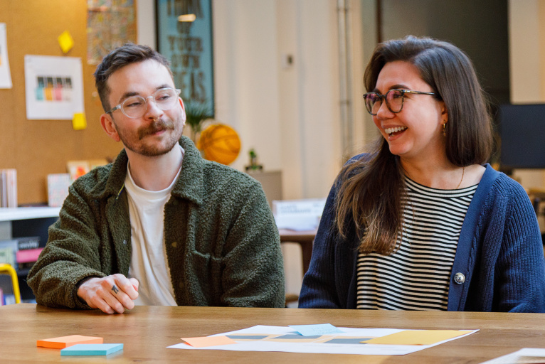
Brand workshopping (ourselves, weird!!) at the start of the process
We started our journey by asking just that very difficult question: who are we? It’s one we always ask our clients but one we found so much harder to answer ourselves. So, who are we? Well, we place a heavy emphasis on creativity and see ideas as our currency. We embrace new challenges and are hungry to learn. We believe wholeheartedly in our three core principles: Creativity Takes Courage; Together is Better; Simple is Good.
When we think about who we are, we think about how we work. As a creative studio, so much of how we communicate every day is through gestures and hand movements. It’s this idea that inspired us to rebrand with the creation of a Fiasco icon series, starting of course with our new A-ok icon – a mark that signifies everything is just right. A seal of approval. An ‘Alllll right’. Something we can own.
Shaka brahhhhh
From there we brought them to life with some fun animation.
We upgraded our brand fonts, so instead of Apercu which has served us well through the years, we’re now using Matter, a grotesk typeface with a subtle, warm touch. Nice.
And finally, we ditched the teal and pumped life into our colour palette through the use of a vivid blue and a yellow to add some extra punch.
The redesign was a chance to revamp all our collateral too, including stationery, presentation decks, social assets and tote bags (everyone loves a tote right?!).

Everyone loves a tote right?!
For the website, we also waved goodbye to .co.uk and said hello to fiasco.design. Like we said, simple is good.
On the UX and design we started from the ground up, paying particular attention to what matters: our work, and how we showcase that work in the best possible way. We also wanted to show more of ourselves and open up the doors of the studio, which is why we commissioned FrancWorks to create this short film. Thanks Luke!
So from today you’ll see a completely new, unified look for the brand. Something we’re all very proud of. It’s a new chapter for the studio and we’re already looking forward to the next one.
From the whole FD team x


