What more can possibly be said about the Airbnb redesign? In my view, the heart of the matter has still not been dealt with.
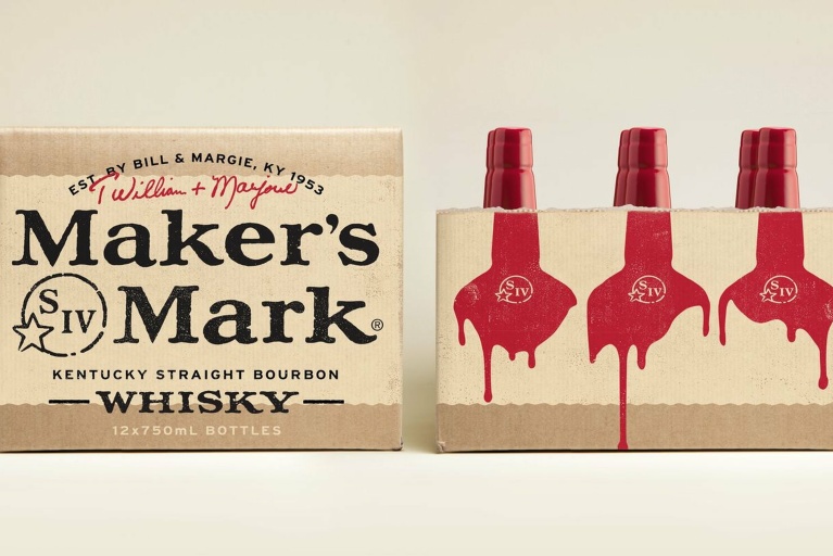
Lets back up a bit. Two weeks ago a fiasco erupted in response to the latest brand update for the global apartment rental service Airbnb, designed by London based agency DesignStudio. They were talking all about our need for ‘belonging’ and their logo, featuring an abstracted letter “A”, was all about customisation and taking ownership. It is all beautifully designed. So far so good.
Then criticism began to ripple through Twitter and not for the first time of course. The logo faced a “backlash on social media”. This hilarious blog sprang up showing how the new logo looks like all manner of genitalia, and all sorts of influencers blogged about it and inevitably Buzzfeed published an 18 Things That Look Like The New Airbnb Logo post. It was funny! Lolz! Good one. No. Wait. What!?

A few of the hundreds of parodies created in reaction to the new Airbnb logo. Bums, boobs, penises and vaginas all feature heavily
That doesn’t look like any genitalia that I’ve seen (or wish to see). What am I missing? And what’s that got to do with the quality or effectiveness of the design?
Granted, all the penises and vaginas are funny and pretty creative, but they have no bearing on the design quality. It only tells us about the quality of YOUR thoughts, not the designers. If your parents buy you a house, you can’t make them look selfish, no matter what you graffiti on the walls. Even if it does look like a penis with that extra garage on the side.
In fact, the mock logos don’t discredit the design work but actually affirm it’s excellence. The creative mockery affirms the accessibility of the image they are attempting to ruin, and unwittingly compliments the designers in their achievement to welcome ownership and belonging.
Those things aside, what is really revealing about this subject is how, on the whole, we are clinging to old paradigms of design excellence that are not fit for the digital era.

DesignStudio, the agency behind the rebrand, set out to design a marque that “everybody could draw”. To really push this idea home, they created an app which allows users to create their own symbol
Underlying this criticism is an archaic view of what a logo should be and do. It comes from an expectation that logos are prescriptive, descriptive, fixed entities that are focussed on clarity and expelling abstraction. They are what they are, and nothing else.
We need to let go of this kind of thinking, because it doesn’t have room for the ever sophisticated goals that brands are trying to achieve. We all know that a logo needs to be evaluated not with personal preferences in mind, but by the effectiveness with which it communicates and takes part in it’s purpose. We don’t impose subjective values unless they clearly expose a failure to achieve objective purposes. We don’t say a hammer is useless because it sometimes looks like a wooden leg.
This is a confirmation to me that we should give less time to listening to what Twitter tweets. I’m all for user-experience to lead design. But users are not experienced in design. They’re stupid! They may be increasingly design literate, but that does not mean they are in any way intelligent. Someone who knows what Helvetica looks like does not necessarily know why it’s better than Comic Sans, or how to put pants on the right way round.
So, lets not listen to Twitter to judge the quality of design work.
Lets not confuse communication with clarity.
Lets not evaluate logos without knowing what they’re for.
Instead, let’s congratulate DesignStudio for their excellent work and say balls (or vaginas) to the rest of them!